Creating a strong visual hierarchy for better user flow
How to use visual hierarchy to simplify user journeys
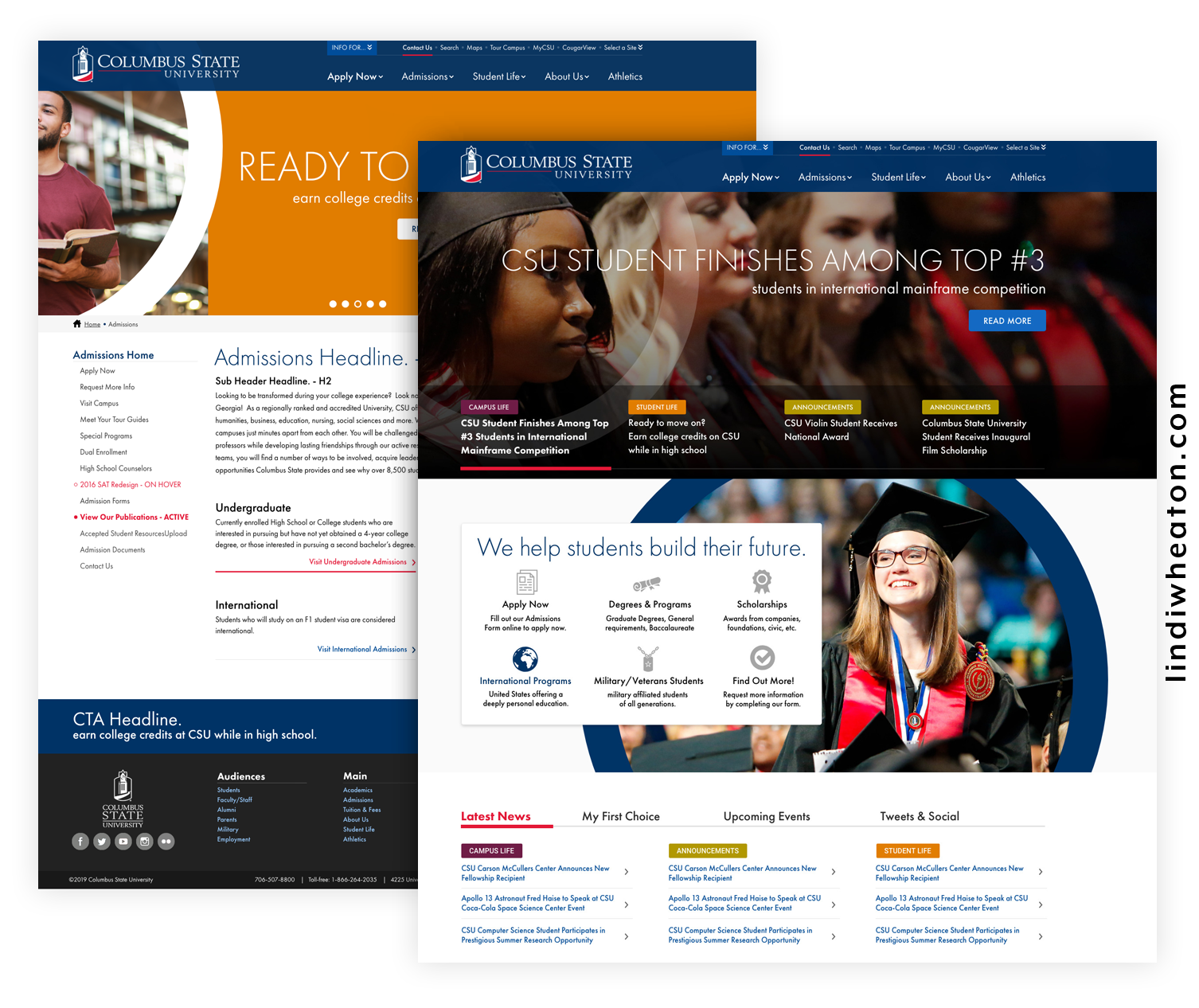
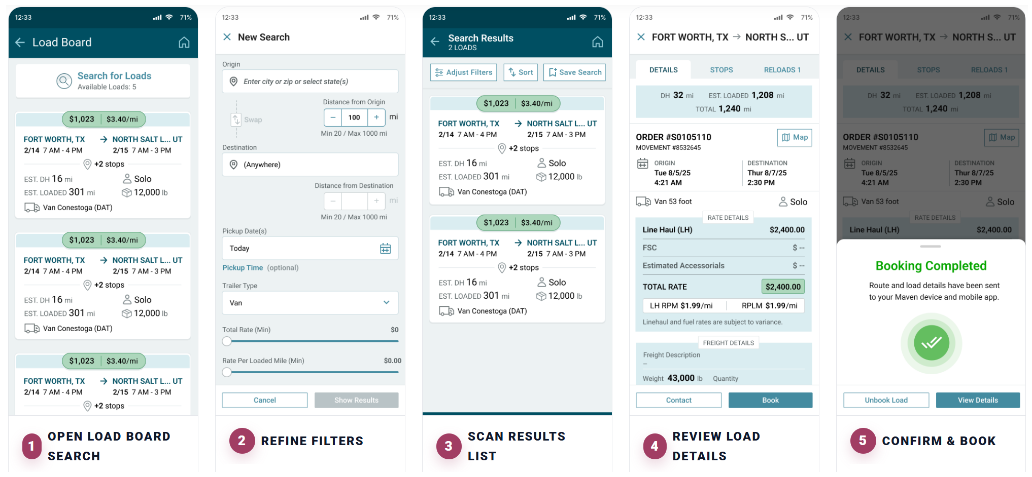
In web and UI design, visual hierarchy is the secret ingredient that guides users through a page effortlessly—helping them understand where to start, what to focus on, and what action to take next. Without a clear hierarchy, even the most beautifully designed interface can feel confusing or overwhelming.
When done right, visual hierarchy transforms your design from pretty to purposeful. Let’s break down how to use hierarchy to improve user flow and engagement.
1. Start with user intent
Before you decide what should stand out, understand why users are visiting your page. Are they looking to book a service, learn more about your product, or complete a quick task? By mapping user goals and behaviors, you can determine what deserves the most visual weight—such as a call-to-action (CTA) button, key headline, or form field.
Pro Tip: Use journey maps or task flows to visualize the path users take from entry to conversion. Then, design your hierarchy to support that journey.
2. Use size and scale to guide attention
Larger elements naturally command attention. Headlines, hero images, and CTAs should appear bigger or bolder than secondary details. This doesn’t mean everything should be oversized—contrast is what creates hierarchy. Use a mix of sizes and spacing to signal importance.
Example:
-
H1 headline grabs attention.
-
Supporting paragraph provides context.
-
CTA button drives the next action.
3. Leverage color and contrast
Color is one of the most powerful tools for directing attention. A strategically placed accent color can draw the eye exactly where you want it to go.
-
Primary actions (like “Get a Quote”) should use your most vibrant, branded color.
-
Secondary actions (like “Learn More”) should be more muted.
-
Use contrast to maintain accessibility (WCAG-compliant color ratios are essential).
Pro Tip: Too many colors dilute your hierarchy. Stick to one or two accent tones and apply them consistently across your design system.
4. Apply typography with purpose
Typography hierarchy helps users scan and digest information quickly.
-
Headings define sections.
-
Subheadings provide structure.
-
Body text communicates details.
-
Microcopy adds reassurance and guidance.
Establish clear typographic rules (font weights, sizes, spacing) in your design system and reuse them consistently across screens. This not only improves readability but reinforces brand identity.
5. Create depth through spacing and alignment
Whitespace—often underestimated—is what gives hierarchy room to breathe. Strategic spacing separates sections, groups related elements, and prevents cognitive overload.
Alignment also plays a key role. A consistent grid helps users predict patterns, allowing their eyes to flow naturally through the content.
Think of spacing as the silent guide in your layout—it organizes the user’s journey without saying a word.
6. Prioritize content with layout and position
Users follow predictable scanning patterns, such as F-patterns and Z-patterns, especially on desktop screens.
-
Place the most important content in the top-left area or centerline of focus.
-
Reserve the bottom sections for secondary or supportive content.
In mobile design, think vertically—users scroll. Keep your primary action visible early in the scroll and repeat it if the page is long.
7. Test and validate with real users
Even the strongest design hypotheses should be tested. A/B testing, heatmaps, or usability sessions can reveal whether users are truly following your intended flow—or getting distracted.
Observe:
-
Where their eyes land first
-
How long they take to find the CTA
-
Whether they scroll or bounce
Use those insights to refine your visual hierarchy continuously.
8. Keep hierarchy consistent across platforms
Users interact with your brand across multiple touchpoints—desktop, mobile, email, or dashboard. Maintaining a consistent hierarchy builds trust and familiarity.
Your CTA should look and feel the same everywhere it appears, reinforcing clarity and user confidence.
Final thoughts: Design with Intention
Strong visual hierarchy isn’t just about aesthetics—it’s about communication. Every color, font size, and layout choice should tell users, “This is what matters most.”
By combining contrast, scale, typography, and spacing with a deep understanding of user goals, you create seamless flows that not only look beautiful but perform beautifully too.
I am a seasoned UX/UI designer with a proven track record of transforming complex business requirements into meaningful, intuitive, and impactful user experiences. With years of experience designing for a wide range of platforms—including websites, enterprise portals, internal business tools, mobile applications, and service-as-a-solution platforms—I bring both creativity and strategic thinking to every project I take on.