Driver App
All-In-One Driver App for Freight, Pay, Routes & Real-Time Support
Enterprise driver mobile app designed to centralize loads, documents, pay, and support in a single experience. As Lead Senior UI/UX Designer, I owned the end-to-end lifecycle—from discovery and journey mapping to Figma system, accessibility, and analytics instrumentation.
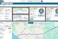
A single starting point for drivers to see their next load, route, weather, messages, and pay—all in one glance.
Research & discovery
Methods
- Ride-along interviews with solo & team drivers to capture real-world workflows on the road.
- Contextual inquiry with dispatch, safety, and payroll to understand cross-team dependencies.
- Audit of legacy apps, SMS threads, and portals to map where information was fragmented.
Insights
- Drivers were juggling 4+ channels (calls, SMS, printed trip sheets, portals) to understand each load.
- Most “urgent” issues were actually gaps in visibility—status, appointments, and pay detail.
- Drivers want clarity and predictability more than “features”; anything complex gets ignored.
Risks
- Multiple business units and fleets had slightly different rules and workflows for loads and pay.
- Cell coverage and device performance varied widely, requiring offline-friendly patterns.
- Trust in prior tools was low, so adoption depended on visible reliability and transparent pay.
Problem
- Drivers lacked a single, up-to-date source of truth for loads, routes, and stop details.
- Documents and PODs were often late or incomplete, delaying billing and settlements.
- Dispatch and driver support were overloaded with basic questions about pay, ETAs, and appointments.
Goals
- Give drivers a clear “start of day” experience: what’s my load, where am I going, and when?
- Reduce support calls by surfacing self-service answers inside each load and pay screen.
- Increase on-time deliveries and document completeness without adding friction to the trip.
User research: qualitative depth + quantitative confidence
To design an app drivers would actually use on the road, we paired deep qualitative research with quantitative data from support tickets and product analytics.
Qualitative depth
- Ride-along sessions with solo & team drivers across different fleets and lanes.
- Moderated usability tests on early Figma prototypes (load view, POD, pay).
- Driver council feedback sessions to review flows and refine terminology.
- Shadowing dispatch, safety, and payroll to see how issues are handled end-to-end.
Quantitative confidence
- Baseline metrics from legacy tools: login failures, POD rejects, support call volume.
- GA4 event model for
home_view,load_open,pod_submit, andpay_view. - Ticket and call-center tagging to quantify top driver pain points by topic.
- Usage and completion rates for critical flows during pilot rollout.
What this unlocked
- Clear prioritization of “must-have” flows: start-of-day, load execution, POD, and pay.
- Evidence to simplify screens instead of adding more options drivers would ignore.
- Measurable targets for success (POD quality, support calls, NPS) tied to specific UX changes.
- A repeatable feedback loop to inform future releases and backlog decisions.
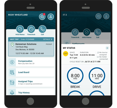
Driver journey we designed around
Driver logs in to see today’s loads, appointments, route, and any critical alerts.
- Start-of-day summary with first load, time windows, and key stops.
- Weather and routing indicators surfaced before leaving the yard.
Driver reviews stop sequence, instructions, and equipment requirements before rolling.
- Tap-through checklist for equipment, seals, and trailer notes.
- Instructions grouped by stop with clear “must read” callouts.
En-route updates, time changes, and issues are managed in one place.
- Timeline view of stops with clear current / next state.
- In-context messages from dispatch tied to the active load.
POD capture, signatures, and load exceptions are captured at the dock.
- Guided POD capture with auto-enhance and blur detection.
- Per-stop document checklist to avoid missing pages.
Driver reviews settlement, bonuses, and home-time plan without calling payroll.
- Trip-by-trip pay breakdown with clear line items.
- Projected settlement and upcoming home-time visible at a glance.
User journey map — steps & emotions
Observed emotions during moderated tests and pilot launch across core driver tasks.
Driver launches the app at the start of the day to see what’s on deck.
- Home shows next load, ETA, and important alerts in one card.
- Clear “Today” vs “Upcoming” split reduces scanning effort.
Driver checks pickup, delivery windows, and special instructions.
- Stop list shows addresses, appointment types, and gate codes.
- “What’s expected” section summarizes key requirements.
At the shipper, the driver checks in and loads freight.
- Dock details and phone numbers surfaced on the active stop.
- We added clearer cues after testing showed missed instructions.
Driver captures signatures and paperwork at delivery.
- Camera flow guides angle, cropping, and quality in real-time.
- Inline “Looks blurry?” prompts reduce rejected documents.
After the trip, driver verifies pay and mileage.
- Pay breakdown card ties each line item back to loads and stops.
- “Report an issue” opens a guided, structured support flow.
Drivers look ahead to home-time and future loads.
- Home-time requests and approvals visible alongside upcoming loads.
- Reduced uncertainty about when they’ll be back with family.
Driver login & 2-way authentication — secure mobile access (5 screens)
This flow highlights how drivers securely sign in from the cab—using mobile-friendly forms, clear error states, and 2-way authentication that balances security with speed.
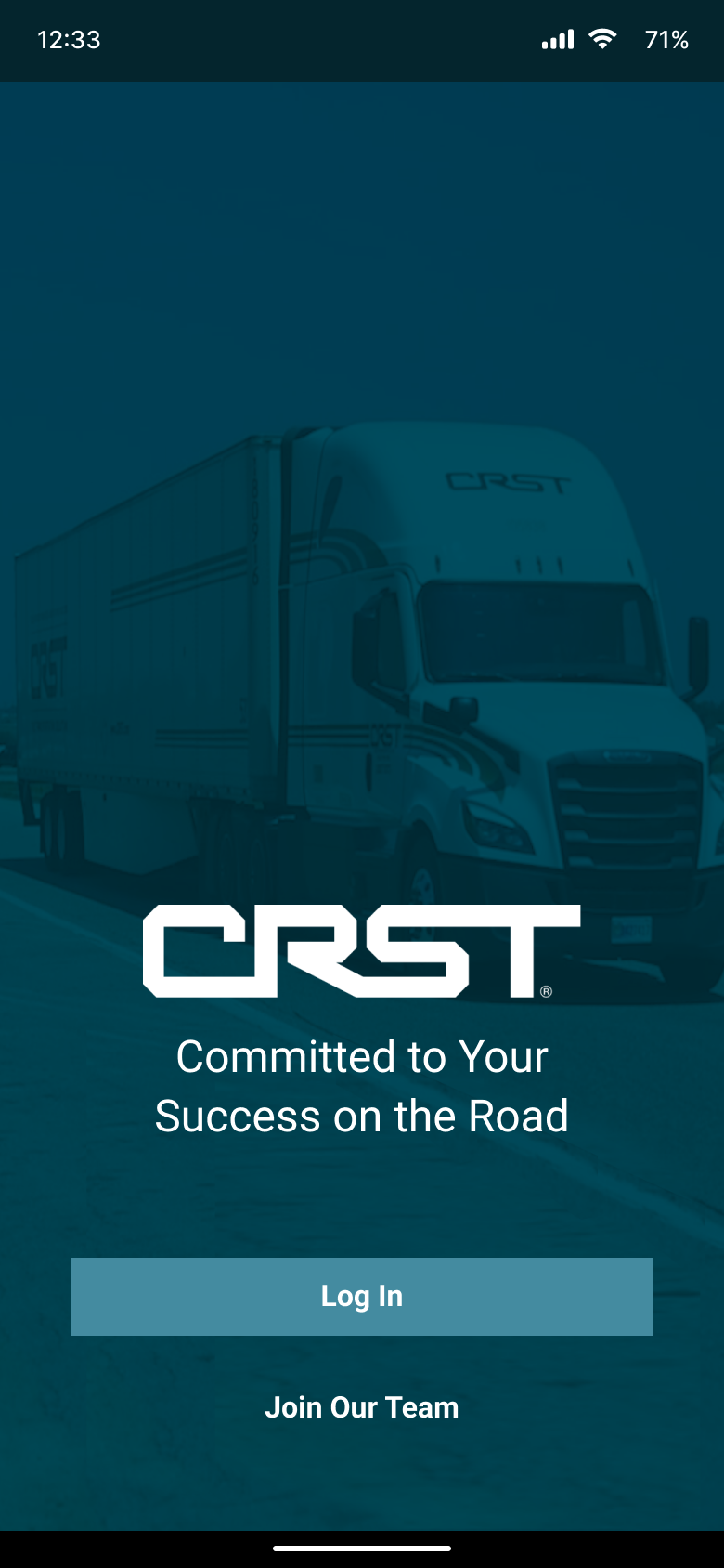
Drivers land on a focused welcome screen with “Sign in” and secondary help links. Typography, contrast, and spacing are tuned for quick scanning in the cab.
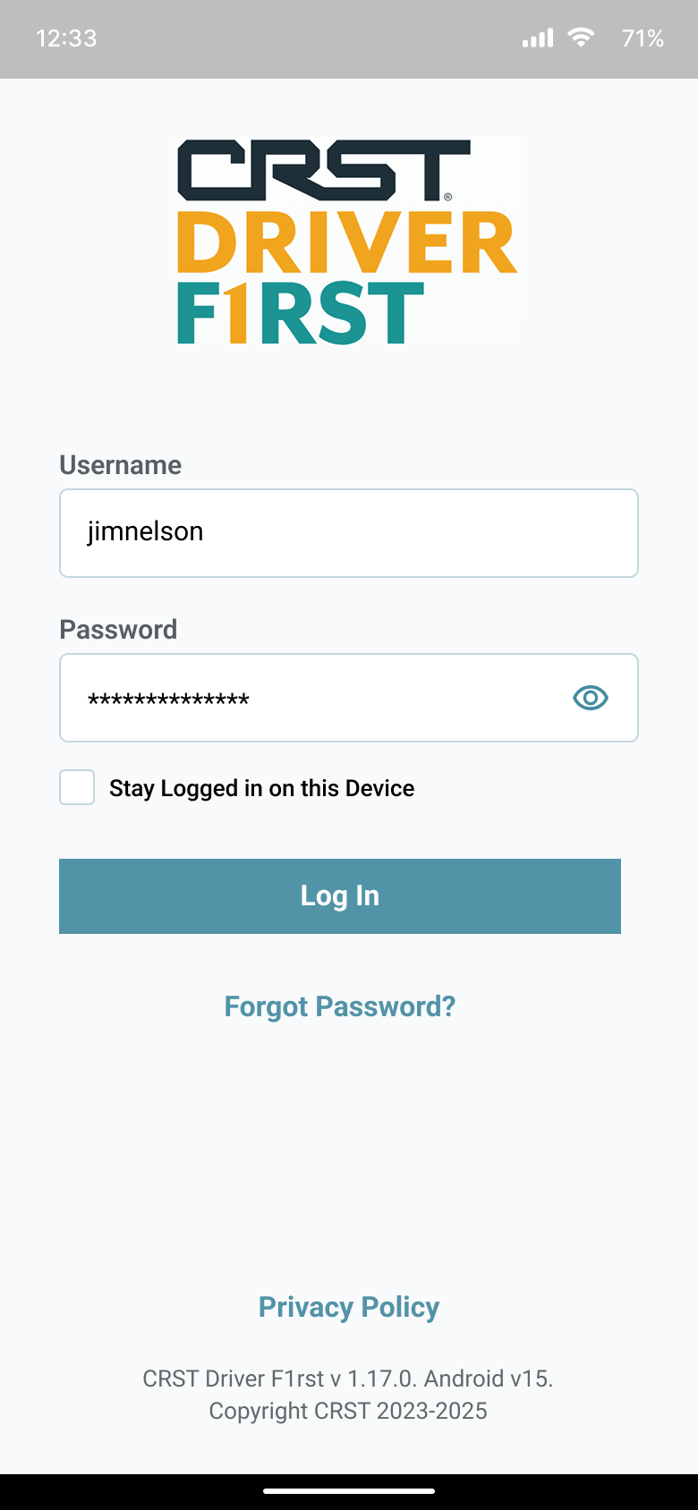
Email and password fields trigger the right OS keyboards, include show/hide password, inline validation, and accessible labels for screen readers and switch controls.
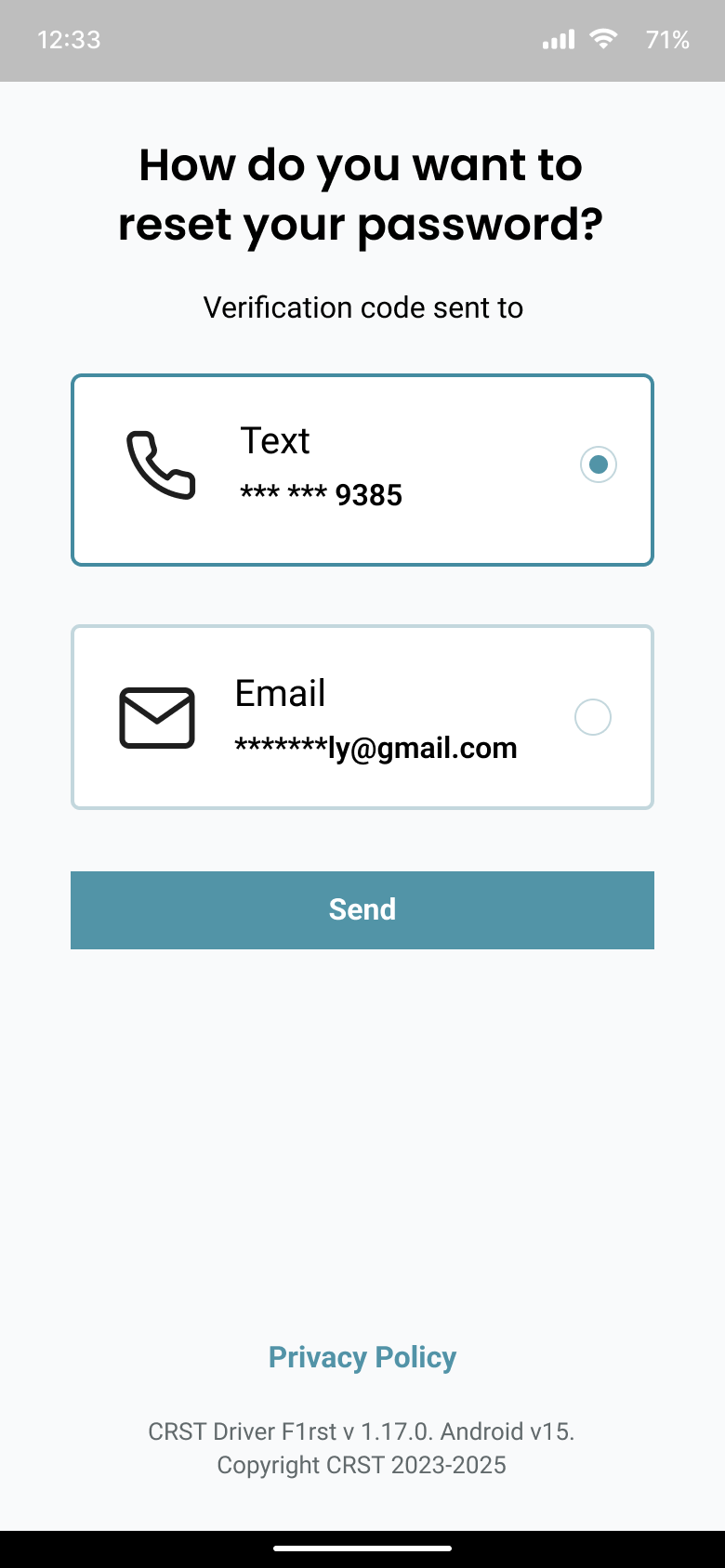
Drivers pick SMS code, authenticator app, or push notification. Each option explains speed and reliability so drivers choose what fits their device and coverage.
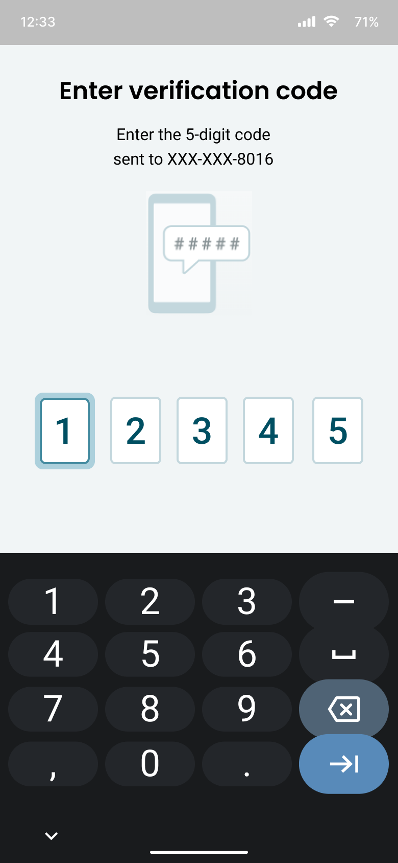
A 6-digit OTP screen uses auto-advance fields, numeric keyboard, countdown timer, and a clear “Resend code” pattern. Errors are explained in plain language with no jargon.
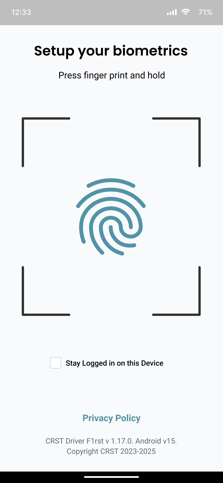
After first successful login, drivers can enable Face ID / fingerprint and choose to trust the device for a limited time window—reducing friction while preserving security.
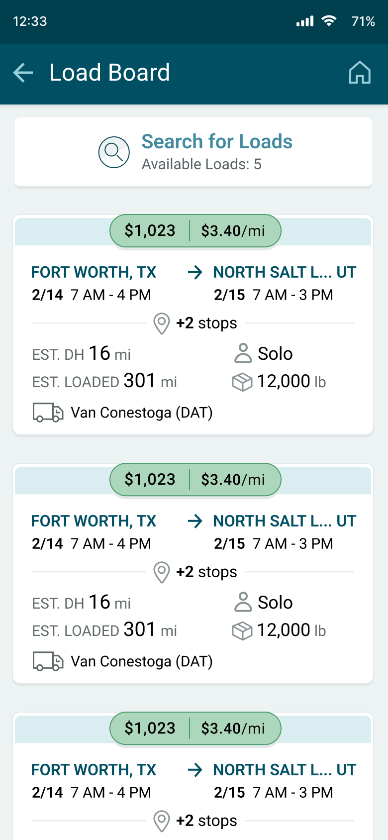
Load Board search — driver user flow (5 screens)
This flow walks through how a driver finds and books their next load in the mobile app—from search filters to confirmation. Use these screens to highlight the end-to-end experience in your portfolio.
Driver taps Load Board from the home screen and sees saved search presets with origin, radius, and date range pre-filled.
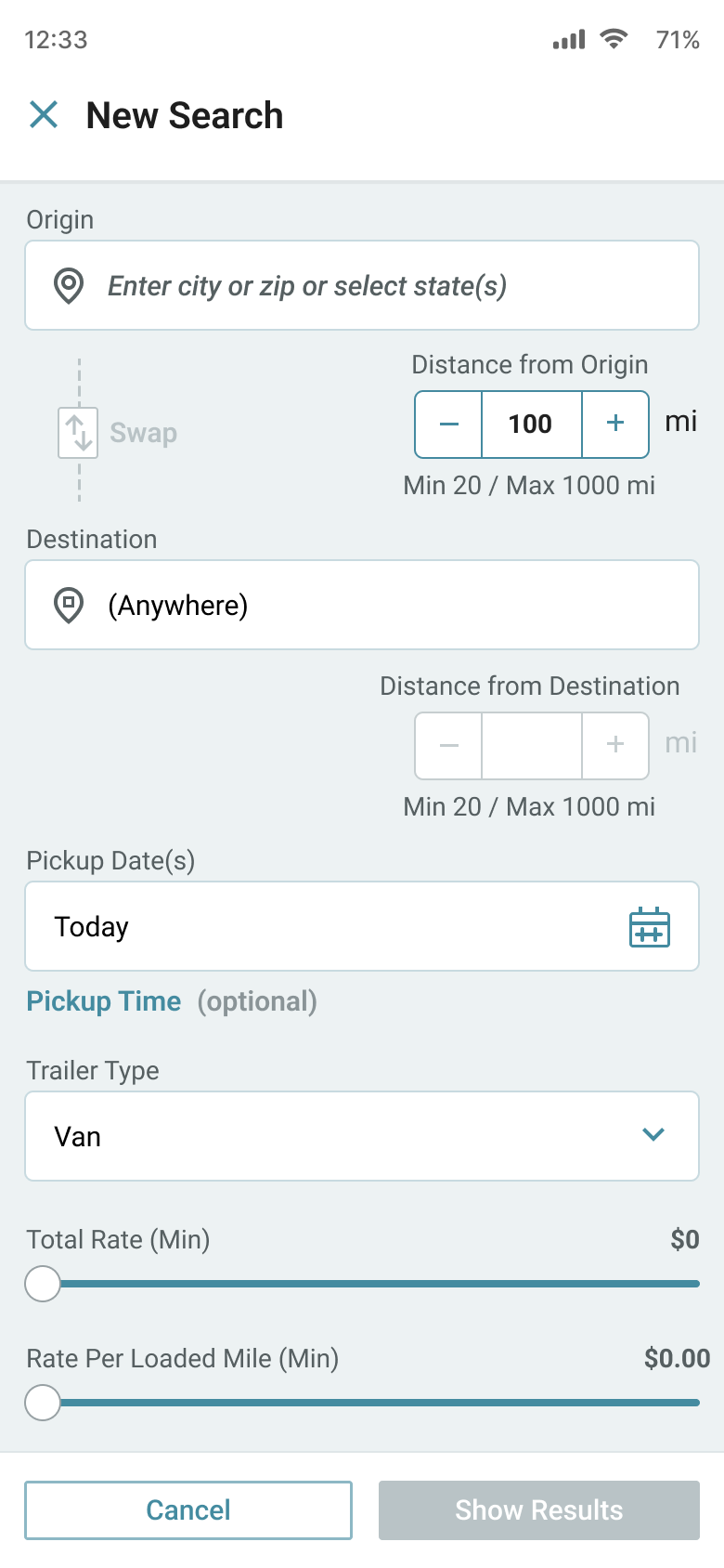
Driver adjusts filters for miles, rate, equipment, and home-time preferences, then saves the combination as a reusable preset.
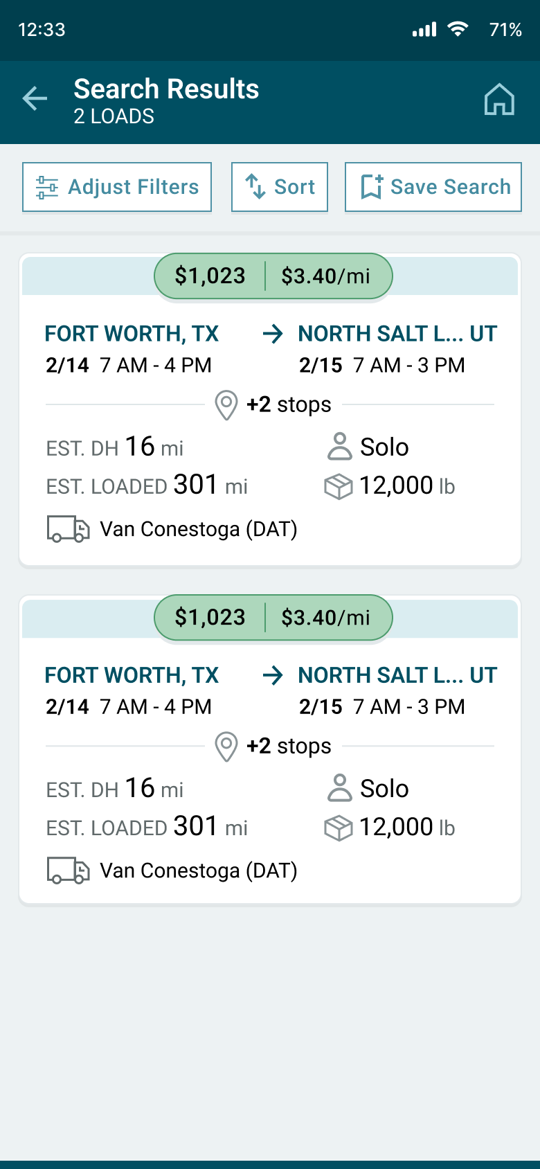
Card-based results surface route, rate, distance, and timing up front so drivers can scan and shortlist the best options quickly.
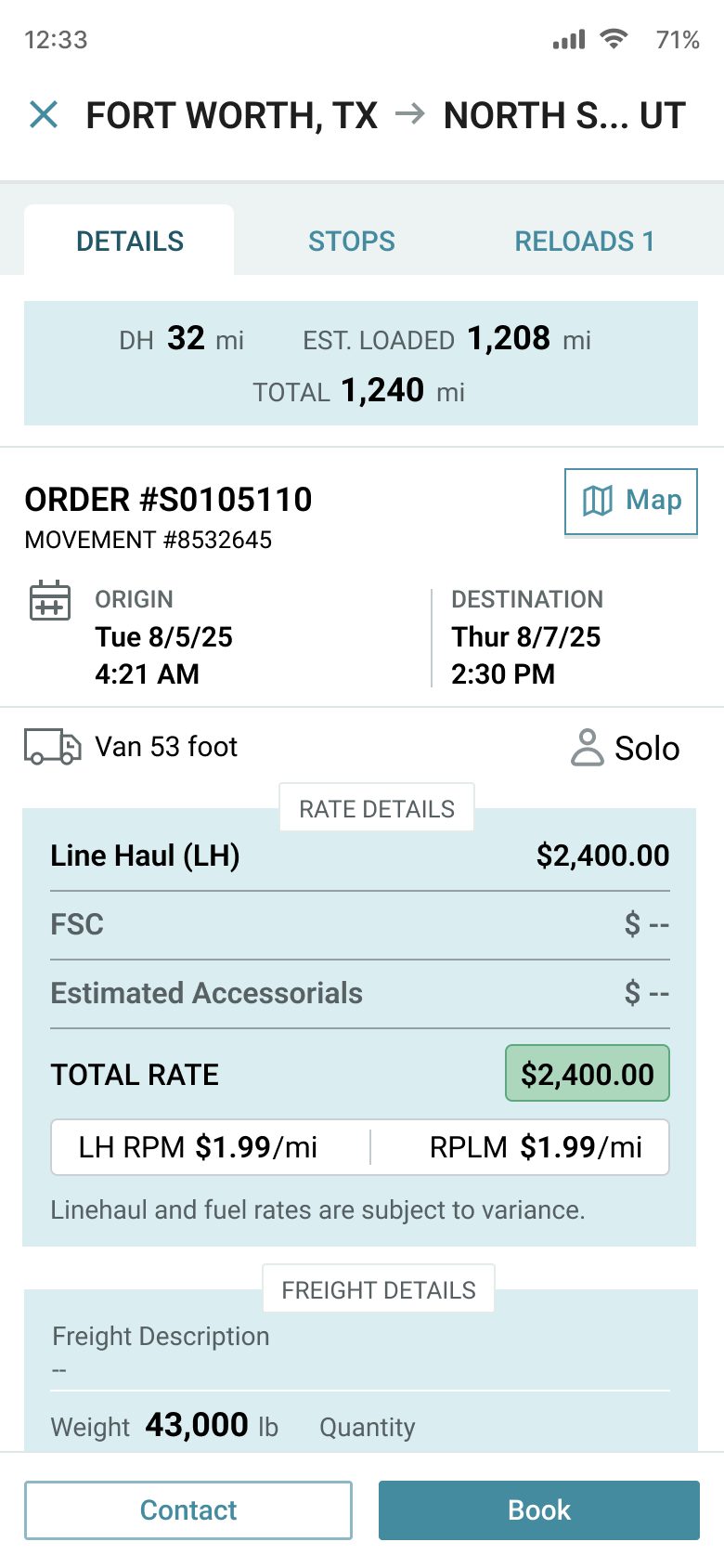
Dedicated details screen shows stops, appointment windows, special instructions, and estimated pay so drivers can make an informed decision.
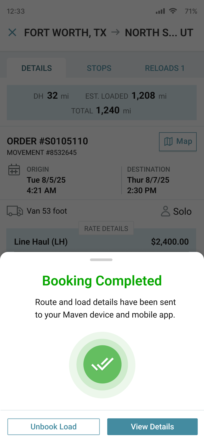
Driver confirms the load, sees a success state, and is taken back into the trip view with their new assignment clearly marked as “Next up”.
End-to-end UI/UX journey & outcomes
The app is structured around the real trips drivers run every day. Each stage of the journey has explicit UX improvements tied to measurable metrics.
| Journey stage | UX improvements | Impact & KPIs |
|---|---|---|
| Plan the day | Start-of-day dashboard with today’s load, appointments, and route; clear separation of “Today” vs “Upcoming” and high-signal alerts (weather, detours, documents). |
|
| Execute load | Timeline-based load view with current / next stop, tap-to-call, and in-context messages pinned to each load. |
|
| Documents & POD | Guided camera flow with auto-enhance, blur detection, and per-stop document checklists. |
|
| Pay & settlements | Trip-based pay details, projected settlement, and structured “Report an issue” flow that captures load, stop, and context automatically. |
|
Analytics, events & feedback loops
To measure impact and guide iterations, I defined an event model for GA4 and created dashboards aligned to driver and operations KPIs.
| Area | Key events | What we measured |
|---|---|---|
| Home & orientation |
|
|
| Load execution |
|
|
| Documents & POD |
|
|
| Pay & issues |
|
|
Qualitative feedback from driver councils and Hotjar in-app surveys validated where to invest next: home-time visibility, lane preferences, and better surfacing of repeat stops and “favorite” routes.
Driver retention — measuring repeat usage and real product value
Retention is one of the clearest signals that the driver experience is valuable enough to bring people back. It validates usability, workflow clarity, and “stickiness” beyond initial adoption.
What retention means in GA4 (plain English)
Retention in GA4 shows the percentage of users who return after their first visit—revealing whether the experience is valuable enough to bring them back.
What it measures
- Drivers who come back over time after a first session
- Or after a first key event (signup, install, first login, first feature use)
Why it matters
- User value
- UX quality
- Content relevance
- Product “stickiness”
Where it lives in GA4
- Reports → Life cycle → Retention
- User retention by cohort
- Retention over time
- User engagement trends
How GA4 calculates retention
GA4 groups users into cohorts based on when they first interacted, then tracks whether they return.
| Cohort timeline | Question GA4 answers |
|---|---|
| Day 0 | Driver opens the app for the first time. |
| Day 1 | Did they come back the next day? |
| Day 7 | Did they return within a week? |
| Day 30 | Did they return within a month? |
Key GA4 retention metrics explained
Percentage of users who return after their first session. Great for UX validation and overall app “stickiness.”
Shows whether you’re only attracting usage—or actually building repeat usage. Low retention + high acquisition often indicates a UX or value gap.
Measures return behavior after a specific milestone (first login, first POD submission, first load booked). Extremely useful for product UX analysis and onboarding validation.
What retention tells you as a UX/UI designer
- Did the interface reduce friction enough to support repeat use?
- Did drivers understand the value fast enough?
- Are workflows intuitive enough for “second use” and “third use” behavior?
- Did the redesign improve real behavior (not just opinions)?
- Confusing navigation
- Poor onboarding
- Slow performance
- Content mismatch with intent
- Forms or flows too long
- Clear value proposition
- Intuitive task completion
- Strong information architecture
- Useful content or tools
- Fast, reliable UI
Retention vs engagement (important distinction)
| Metric | What it answers |
|---|---|
| Retention | Do users come back? |
| Engagement | What do they do while they’re here? |
When retention matters most
- SaaS platforms
- Driver / carrier portals
- Internal operations tools
- Lead-gen sites with long sales cycles
- Content-heavy or SEO-driven websites
Monetization — using events to expose friction, improve flows, and find innovation opportunities
I used GA4’s Monetization reporting as a product analytics framework—not just to track outcomes, but to understand where drivers dropped off, which tasks created support load, and what workflow improvements would unlock repeat usage and long-term value.
What I instrumented
- Mapped key driver tasks into measurable steps (login → load → docs → pay).
- Created a consistent GA4 event taxonomy with clear naming, parameters, and success definitions.
- Tracked completion, drop-off, retries, and “help-seeking” behavior to reveal friction.
What I looked for
- Which steps caused abandonment or slowdowns (drop-off + time to complete).
- Where drivers repeated actions (retries, backtracks, re-uploads) indicating unclear UI.
- Which flows correlated with fewer support calls and better outcomes.
How it drove action
- Turned event findings into prioritized UX fixes (copy, IA, validation, error handling).
- Identified “high-value moments” worth surfacing earlier (start-of-day + pay clarity).
- Found opportunities for automation and self-service to reduce manual support.
Event-driven process tracking (how I found friction + opportunities)
I created events to track each critical process step and used the results to suggest workflow changes and uncover innovation opportunities—especially where repeat actions, drop-offs, or support behaviors spiked.
| Process | Events I defined | What I found | UX changes & innovation opportunities |
|---|---|---|---|
| Login & access |
|
|
|
| Load discovery |
|
|
|
| POD submission |
|
|
|
| Pay clarity |
|
|
|
Accessibility & inclusive design
| Area | Standard | Status | Notes |
|---|---|---|---|
| Color & contrast | WCAG 2.2 AA | Met | High-contrast themes for cab glare; all text & icons meet AA contrast. |
| Touch targets | 2.5.5 | Met | Minimum 44px touch targets; thumb-zone placement for primary actions. |
| Keyboard & switch | 2.1.1 | Met | Flows are navigable via external keyboard / switch controls for some drivers. |
| Semantics & labels | ARIA / HTML | Met | Descriptive labels, roles, and accessible names on all interactive elements. |
| Motion & haptics | 2.3.1 / prefers-reduced-motion | Met | Subtle motion only; respects OS “reduce motion”; haptics limited to key confirmations. |
| Offline / low-bandwidth | Robustness | Review | Critical details cached locally; additional work planned on error states in dead zones. |
Design system highlights
Color & density
Brand and accent colors optimized for cab environments (glare, low light) with AA contrast. Components tuned for touch targets at 44px+.
Typography & layout
Type scales and clamp-based headings for small devices. Card-based layout keeps critical info near the thumb zone.
Components & states
Status chips, load cards, message previews, alert banners, and document states built as reusable variants to support future features.
Hire a UI/UX Designer who delivers results through research and prototyping
I design scalable, data-informed digital experiences that simplify complex workflows and drive measurable business outcomes. From research to high-fidelity design prototypes, I help product teams ship solutions that reduce friction, boost adoption, and perform reliably at enterprise scale.