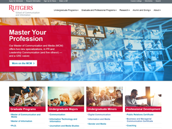
Rutgers School of Communication and Information
Clarity from exploration to enrollment
As a UX and Web Designer, I help universities turn sprawling content into intuitive paths. For Rutgers School of Communication and Information (SC&I), I led research, IA, design system, and validation to improve program discovery, admissions clarity, and accessibility across devices.
Rutgers SC&I — Program & Admissions UX
Rutgers SC&I — UI/UX Journey Map
Research & Discovery
Mapped how prospects, parents, and transfers explore SC&I programs. Quant + qual revealed duplicate labels, long click paths, and unclear cost/requirements across undergraduate and graduate paths.
- 22 user interviews (prospects, parents, transfers, returning adult learners)
- 7 stakeholder sessions (Enrollment, Marketing, Program Directors, IT)
- GA4 funnel & on-site search audit; Hotjar scroll/click heatmaps
Information Architecture & Strategy
Consolidated deep menus; introduced task-first navigation and contextual breadcrumbs. Established a unified taxonomy for degree types, certificates, and delivery modalities across SC&I disciplines.
- Sitemap & taxonomy rationalization
- User flows for Explore → Compare → Requirements → Apply
- Content model & governance (authoring rules, lockable blocks)
Wireframing & Prototyping
Iterated low-fi to high-fi with interactive prototypes across mobile/desktop and high-priority tasks.
- Wireframes → clickable prototypes (mobile, tablet, desktop)
- Filter patterns (degree, discipline, college/school, delivery, interest)
- Early a11y checks; content density and tap-target audits
Visual Design & Interaction
Built a tokenized system for color, type, spacing, and elevation; defined reusable program templates and micro-interactions with reduced-motion alternatives.
- Design tokens & component variants (cards, tables, CTAs)
- Anchored sections, sticky CTAs, in-page nav & “Back to Top”
- Contrast QA, focus rings, and keyboard parity
Testing, Iteration & Launch
Conducted 3 moderated rounds; tuned filters/labels, elevated key CTAs, and refined authoring guardrails. Handoff included specs, redlines, and a governance guide.
- 3× moderated tests (n=16) + post-launch GA4 monitoring
- Design QA with Dev; token handoff + Storybook mapping
- Author training: alt text, headings, link purpose, tables
Rutgers SC&I — Results & Impact
Measured in first 90 days post-launch (GA4, Hotjar). “pts” = percentage points; “%” = relative change.
What changed
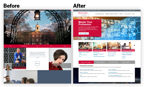
- Unified degree taxonomy and filter model across disciplines and delivery modalities, helping prospective students quickly compare majors and discover related programs.
- Introduced modular program templates with hero stats, learning outcomes, faculty highlights, and anchored sections to promote scanning and transparent academic value.
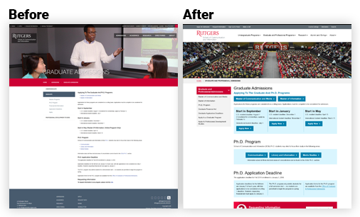
- Redesigned admissions workflows with guided steps, “What you’ll need” panels, and sticky CTAs—simplifying requirements and increasing application flow efficiency.
- Developed a tokenized design system aligned with brand standards, mapping components to Storybook for seamless handoff and consistency across academic and marketing pages.
- Partnered with content and accessibility teams to ensure WCAG-compliant typography, structured hierarchy, and responsive layouts optimized for mobile-first exploration.
End-to-End UI/UX Journey & Outcomes
| Journey Stage | Before | After | Impact |
|---|---|---|---|
| Discovery Problem Framing | Competing priorities; no shared KPIs; anecdotal decisions. | KPI-backed scenarios; prioritized success metrics; test plan. | +Faster scoping · fewer pivots; clearer PRDs. |
| IA Navigation & Flows | Deep menus; duplicate labels; long time-to-task. | Task-first IA; breadcrumbs; guardrails for authoring. | −30–36% time-to-find; improved wayfinding. |
| Design System & Patterns | One-off blocks; inconsistent CTAs; rework across pages. | Tokenized components; locked styles; responsive templates. | +Delivery speed · fewer defects; easier governance. |
| Validation Usability & Data | Limited evidence; unclear adoption risks. | 3× moderated tests; GA4 funnels; heatmaps for iteration. | +Confidence at launch; targeted backlog. |
| Accessibility Compliance | Low contrast; hidden focus; placeholder “labels”. | AA contrast; visible focus; labeled forms; skip links. | AA achieved; improved mobile completion. |
Outcomes & Measurable Results
Within the first 90 days post-launch, engagement rose and friction dropped across key decision journeys.
| Metric | Before | After | Result |
|---|---|---|---|
| Task Completion — “Find a Program” | 54% | 85% | +31 pts completion |
| Bounce Rate — Admissions > Requirements | 74% | 58% | −16 pts bounce |
| Apply / Request Info Click-through (site-wide) | — | — | +25–30% relative lift |
| Program Page Engagement (avg. time on page) | — | — | +20%+ |
| Authoring Efficiency | Unstructured blocks | Reusable templates | −30–40% update time (editor survey + Jira cycle time) |
Sources: GA4 events (apply_now_click, request_info_click, view_program_detail, search_results_view),
Hotjar scroll/click maps, moderated usability tests (3 rounds), and author survey.
UX Improvements Matrix
| Area | Before | After | Impact |
|---|---|---|---|
| Homepage Hero & CTAs | Competing CTAs; unclear priority actions. | Primary/secondary hierarchy; task chips for Explore, Visit, Apply, Request Info. | +Task starts into Programs & Admissions. |
| Programs Findability | Long lists; inconsistent naming across disciplines. | Facet filters (degree, discipline, modality, interests). | −Clicks to detail; higher filter use. |
| Templates Reuse | One-offs; layout shift. | Locked templates with set ratios; sticky CTAs; anchored nav. | +Consistency & governance; fewer regressions. |
| Performance Media | Unoptimized images; CLS spikes. | Defined sizes, lazy-load, WebP decision tree. | +Core Web Vitals & smoother scroll. |
Improvements Mapped to Outcomes
Evidence-driven changes tied to student problems and measurable impact.
| UX Area | Problem / Insight | Improvement | Intended Impact |
|---|---|---|---|
| Navigation | Students missed Programs & Cost due to deep menus and duplicate labels. | Consolidated IA; context breadcrumbs; “Explore Programs” entry points. | Faster wayfinding; higher task starts. |
| Admissions | Requirements were buried; no clear path from interest → apply. | In-page nav, checklists, sticky CTAs, and “What you’ll need” panels. | Reduced abandonment; more Apply/Request Info clicks. |
| Accessibility | Low contrast; hidden focus; small mobile targets. | AA palette; visible focus; 44px+ targets; semantic headings. | Inclusive access; better mobile completion. |
| Content Governance | Inconsistent components caused rework and regressions. | Reusable library; locked styles; author guide & checklists. | Fewer defects; faster publishing. |
| Program Pages | Dense paragraphs; outcomes buried. | Modular sections (Outcomes, Careers, Faculty, Cost & Aid, FAQ). | Higher engagement; clearer decision support. |
Accessibility Compliance Checklist
| Criterion | Before | Fix | Status |
|---|---|---|---|
| Contrast AA (1.4.3) | Buttons/links below 4.5:1; low-contrast body text. | Tokenized AA palette; body & UI contrast checks. | AA Pass |
| Semantic Landmarks | Div soup; missing headings/landmarks. | H1–H3 hierarchy; header/nav/main/footer roles. | Implemented |
| Keyboard Focus | Hidden focus; no skip link. | Visible focus ring; Skip to content; logical tab order. | Implemented |
| Images Alt text | Descriptive vs decorative not separated. | Meaningful alt; decorative set to empty alt. | Implemented |
| Forms Labels & Errors | Placeholder-only labels; unclear errors. | Explicit labels; aria-describedby; inline error patterns. | Implemented |
Accessibility Compliance Checklist & Outcomes
WCAG 2.2 AA targets connected to concrete author and student outcomes.
Accessibility Compliance Checklist (WCAG 2.2 AA)
| Criterion | What We Ensured | Status | Notes / Evidence |
|---|---|---|---|
| Color Contrast | All text & UI meet 4.5:1 (normal) / 3:1 (large); focus states visible. | Pass | Lighthouse/AXE reports; palette tokens in design system. |
| Keyboard Navigation | Full keyboard access; no traps; logical order; skip links. | Pass | Manual QA (Tab/Shift+Tab); NVDA/VoiceOver spot checks. |
| Focus Indicators | High-contrast focus rings on all actionable elements. | Pass | Custom focus styles documented in tokens. |
| Semantics & Landmarks | Correct headings (H1–H6), roles, and landmarks. | Pass | HTML outline + WAVE validation. |
| ARIA (as needed) | Only to enhance semantics for complex widgets. | Pass | Accordions & modals labeled; native-first approach. |
| Media Alternatives | Captions/transcripts; image alt text guidance for authors. | Pass | Author checklists included in CMS training. |
| Forms & Errors | Labels tied to inputs; clear instructions and error messaging. | Pass | Patterns documented in component library. |
| Responsive & Zoom | Usable at 320px; supports 200%+ zoom without loss of content. | Pass | Breakpoint QA; no horizontal scroll on text pages. |
| Touch Targets | ~44px targets; adequate spacing between controls. | Pass | Mobile audit on iOS/Android devices. |
Schedule a Meeting with Lindi
Interested in collaborating or need help improving your user experience? I work with universities and businesses to design interfaces that drive measurable results.