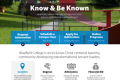
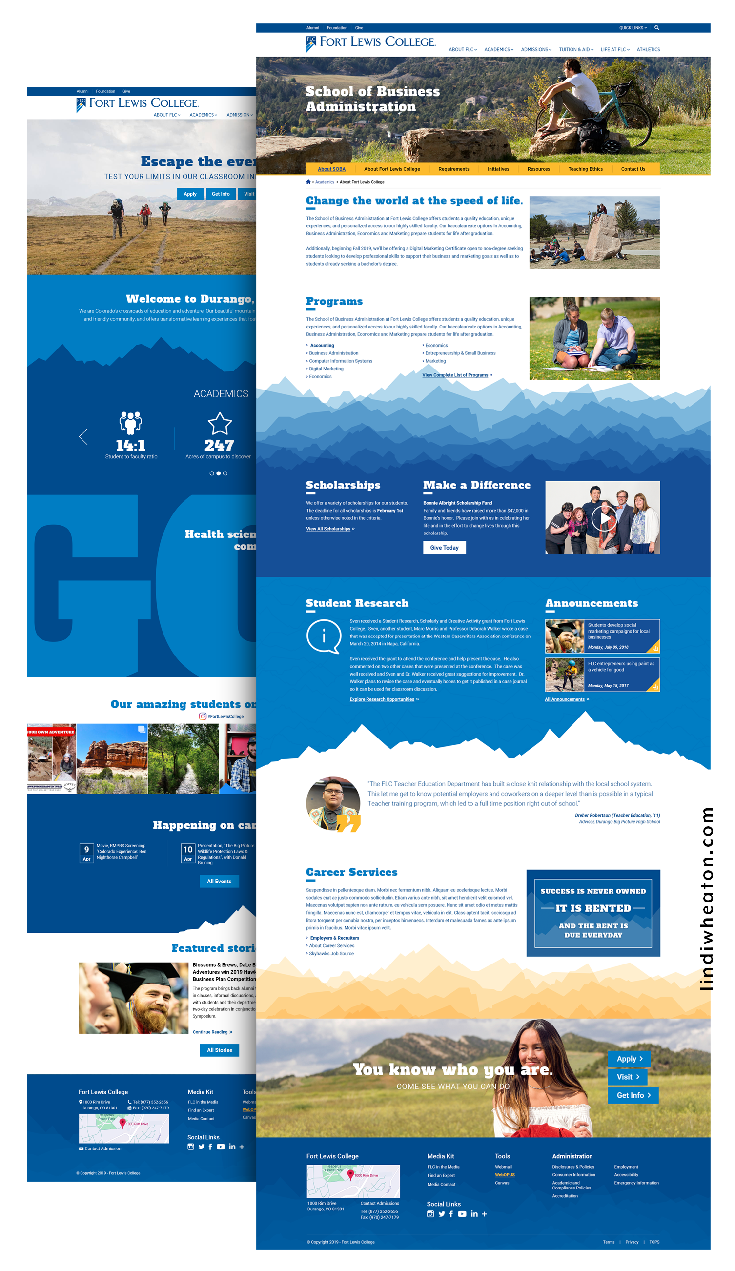
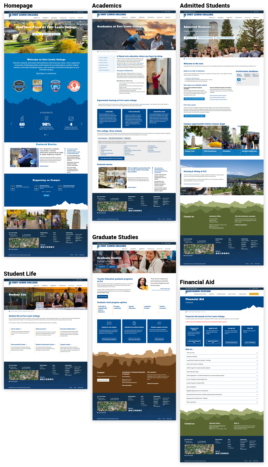
Fort Lewis College
Reducing friction from discovery to decision
As a UX and Web Designer, I help colleges turn sprawling content into intuitive paths. For Fort Lewis College, I led research, IA, design system, and validation to improve program discovery, admissions clarity, and accessibility across devices.
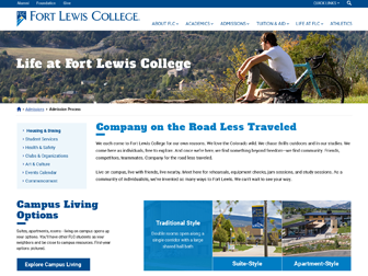
Fort Lewis College — Website Redesign
Fort Lewis College — UI/UX Journey Map
Research & Discovery
Mapped how prospects, parents, and transfers search and decide. Quant + qual revealed duplicate labels, long click paths, and unclear cost/requirements.
- 26 user interviews (prospects, parents, transfers, first-gen)
- 8 stakeholder sessions (Enrollment, Marketing, IT, Academics)
- GA4 funnel & search-log audit; Hotjar click/scroll heatmaps
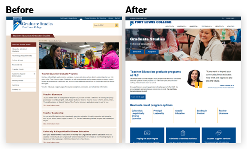
Information Architecture & Strategy
Consolidated deep menus; introduced task-first navigation and contextual breadcrumbs. Established a unified taxonomy for degrees, certificates, and modalities.
- Sitemap & taxonomy rationalization
- User flows for Explore Programs → Compare → Requirements → Apply
- Content model & governance (authoring rules, lockable blocks)
Wireframing & Prototyping
Iterated low-fi to high-fi with interactive prototypes covering mobile-first breakpoints and priority tasks.
- Wireframes → clickable prototypes (mobile, tablet, desktop)
- Filter patterns (degree, school/college, delivery, interest)
- Early a11y checks; content density and tap-target audits
Visual Design & Interaction
Built a tokenized system for color, type, spacing, and elevation; defined reusable program templates and micro-interactions with reduced-motion alternatives.
- Design tokens & component variants (cards, tables, CTAs)
- Anchored sections, sticky CTAs, in-page nav & “Back to Top”
- Contrast QA, focus rings, and keyboard parity
Testing, Iteration & Launch
Conducted 3 moderated rounds; tuned filters/labels, elevated key CTAs, and refined authoring guardrails. Handoff included specs, redlines, and a governance guide.
- 3x moderated tests (n=18) + post-launch GA4 monitoring
- Design QA with Dev; token handoff + Storybook mapping
- Author training: alt text, headings, link purpose, tables
Heatmaps & Screen Recordings (Hotjar)
GA4 showed where students dropped off. Hotjar revealed how they behaved on-page—highlighting usability friction, user patterns, and interaction behavior across Programs, Admissions, and Apply flows.
Heatmaps
Click + scroll maps surfaced where users expected actions, missed CTAs, or stopped reading.
- Click patterns: identify dead-clicks, mis-clicks, and CTA discoverability issues
- Scroll depth: validate content placement and where attention dropped off
- Mobile vs desktop: compare behavior differences by device
Screen recordings
Session replays exposed hesitation, backtracking, rage clicks, and unclear next steps.
- Behavior signals: hesitation, pogo-sticking, repeated filter changes
- Usability friction: confusing labels, buried requirements, unclear “next step”
- Evidence for stakeholders: short clips to align on priorities fast
Fort Lewis College — Results & Impact
Measured in first 90 days post-launch (GA4, Hotjar). “pts” = percentage points; “%” = relative change.
What changed
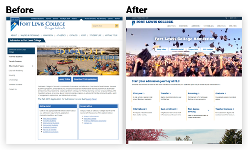
- Unified degree taxonomy and filter model across colleges, departments, and delivery modalities, helping prospective students quickly compare majors and discover related programs.
- Introduced dynamic program templates featuring hero stats, learning outcomes, faculty highlights, and anchored in-page sections to promote easy scanning and transparent academic value.
- Redesigned admissions workflows with guided steps, “What to Expect” timelines, and persistent sticky CTAs—simplifying complex requirements and increasing application flow efficiency.
- Developed a tokenized design system aligned with brand standards, mapping components to Storybook for seamless handoff and visual consistency across marketing and academic pages.
- Collaborated closely with content and accessibility teams to ensure WCAG-compliant typography, structured content hierarchy, and responsive layouts optimized for student devices.
End-to-End UI/UX Journey & Outcomes
| Journey Stage | Before | After | Impact |
|---|---|---|---|
| Discovery Problem Framing | Competing priorities; no shared KPIs; anecdotal decisions. | KPI-backed scenarios; prioritized success metrics; test plan. | +Faster scoping · fewer pivots; clearer PRDs. |
| IA Navigation & Flows | Deep menus, duplicate labels; long time-to-task. | Task-first IA; breadcrumbs; guardrails for authoring. | −36% time-to-find program; improved wayfinding. |
| Design System & Patterns | One-off blocks; inconsistent CTAs; rework across pages. | Tokenized components; locked styles; responsive templates. | +Delivery speed · fewer defects; easier governance. |
| Validation Usability & Data | Limited evidence; unclear adoption risks. | 3x moderated tests; GA4 funnels; heatmaps for iterating. | +Confidence at launch; targeted backlog. |
| Accessibility Compliance | Low contrast; hidden focus; placeholder “labels”. | AA contrast; visible focus; labeled forms; skip links. | AA achieved; improved mobile completion. |
Schedule a Meeting with Lindi
Interested in collaborating or need help improving your user experience? I work with universities and businesses to design interfaces that drive measurable results.