All-In-One Dispatch Operations Platform
Streamlining Dispatch, Load Visibility & Driver Workflows
The Dispatch Operations Platform is a centralized transportation system that unifies dispatch, load tracking, and driver support into a single, role-based application. As Lead UI/UX Designer, I guided the full product design lifecycle—including user research, workflow analysis, journey mapping, information architecture, wireframes, high-fidelity UI, and interactive prototypes—to simplify complex workflows and enhance operational clarity.
Through iterative prototyping and usability validation, I transformed real-time maps, order timelines, and operational data into an intuitive, scalable interface used across HR, Safety, Sales, and Dispatch. The platform improves communication, accelerates load assignment, and reduces errors by bringing teams together around one consistent source of truth.
| Role | Senior UI/UX Designer · Research → Launch |
|---|---|
| Platform | Enterprise web application · Internal use |
| Teams Served | Dispatch · Operations · Safety · HR · Sales |
| Tooling | Figma · Jira · Confluence · GA4 · Moderated Interviews · Surveys · Ride-along Research |
Ride-alongs + contextual inquiry exposed tool-switching, lane-first thinking, and partial identifiers.
Sitemap + role-based dashboards aligned navigation to “find, assign, recover, document”.
Components + patterns made dense operational data scannable, consistent, and scalable.
GA4 search logs + retention cohorts exposed friction and prioritized the highest ROI fixes.

Faster load assignment after consolidating tools into a single, role-based dispatch dashboard.
Loads, drivers, tractors, trailers, vendors, and balances surfaced in one interface.
Dispatch, HR, Safety, and Sales aligned around the same live operational data.
Internal system designed to scale with new lanes, fleets, and departments.
Operational Problem
Dispatchers and operations teams were juggling multiple tools, spreadsheets, and legacy systems just to understand where freight, tractors, and drivers were at any given moment. Without a shared, real-time view, teams struggled to spot risks early, assign loads efficiently, or support drivers when issues surfaced on the road.
The Dispatch Operations Platform was designed as a single, scalable dispatch system that provides a live United States map, centralized load tracking, and role-tailored views so each team can act quickly on the information that matters most.
- Operational decisions happen in minutes, not hours—visibility and findability are mission-critical.
- Data arrives from multiple systems with different timing, formats, and edge cases.
- Risk work (late freight, missing docs, equipment changes) spikes during peak windows and shift handoffs.
Strategic Goals
- Unify dispatch, driver, and operations data into one platform.
- Improve visibility into loads, tractors, trailers, and routes across the U.S.
- Streamline daily workflows and reduce manual tool-switching.
- Support role-based dashboards for Dispatch, Safety, HR, and Sales.
User Roles
The platform supports multiple teams with different responsibilities. Role-based dashboards and shared objects (loads, drivers, equipment, documents) ensure each team sees the right context without hiding the source of truth.
Dispatchers
Assign, monitor, recover.
- Find loads fast with partial identifiers and lane shorthand.
- Confirm driver/equipment eligibility before assignment.
- Resolve exceptions with clear “next action.”
Safety & Compliance
Incidents, violations, documentation.
- See risk states, incidents, and status changes at a glance.
- Track documentation completeness and follow-ups.
- Reduce “where is it?” calls with shared visibility.
HR / Driver Managers
Capacity, utilization, support.
- Understand utilization and availability by driver and team.
- Support drivers with fewer handoffs and less ambiguity.
- Improve clarity across paired drivers and assignments.
Sales / Ops Leadership
Performance visibility, planning.
- View lane and service performance with shared definitions.
- Spot constraints early (equipment, capacity, exceptions).
- Use trends + adoption signals to guide investments.
User research: qualitative depth plus quantitative confidence
Qualitative research finds problems and ideas, providing depth, while quantitative research validates patterns and tracks trends, offering breadth and hard numbers for decisions. For this dispatch platform, I intentionally used both — often in sequence — to move from “what’s really happening on the floor?” to “how big is this, and did our design changes actually help?”.
Qualitative research: ride-alongs, interviews & contextual inquiry
To understand how dispatch work actually happens, I started with qualitative UX research — spending time in the dispatch room and on the road to see real behavior, language, and workarounds.
- Dispatcher interviews: 1:1 sessions with day shift, night ops, and planners to map out how they find loads, recover late freight, and support drivers in crisis moments.
- Contextual inquiry: Shadowed dispatchers during peak windows to observe tool-switching between TMS, spreadsheets, email, and whiteboards.
- Ride-along research: Joined drivers on runs to see how mobile apps, phone calls, and messages actually fit into their workflow.
- Artifacts review: Collected screenshots, personal “cheat sheets,” and sticky notes that dispatchers used to track tractors, trailers, and status shorthand.
The goal of this qualitative work was to find problems and ideas, not to prove anything yet: uncover language (“preplan”, “recovering a load”), mental models (lane-first thinking), and edge cases that a simple metrics dashboard would never reveal.
Quantitative research: surveys & behavioral analytics
Once qualitative work surfaced the right hypotheses, I layered in quantitative research to validate and size those patterns and to track outcomes over time.
- Baseline dispatcher survey: Measured perceived time-to-find-load, confidence in the current tools, and top pain points prior to redesign.
- Post-launch feature survey: In-app micro-survey on the new load board and global search (e.g., “How easy was it to find the right load?” on a 1–5 scale).
- Behavioral analytics in GA4: Events for
in_app_search,view_search_results,assign_load, andsearch_no_resultsto track search behavior and funnel drop-off. - Trend tracking: Monitored load assignment time, number of refinements per search, and feature adoption by role to determine whether changes were moving the right needles.
Quantitative data gave us breadth and hard numbers — validating that the issues found in a few dispatchers’ workflows were widespread enough to prioritize, and that the new patterns delivered measurable gains.
Leading identifiers & search opportunities
A key research theme was how dispatchers initiate searches with partial information — what I call leading identifiers. Understanding these identifiers revealed concrete opportunities to tune the search experience.
- Lane shorthand (e.g., “CHI → ATL”) used far more often than full city names.
- Driver first name + truck number (“Mike on 4321”) as the default recall pattern.
- Customer nicknames instead of official customer codes or long legal names.
- Status phrases like “late”, “unassigned”, or “missing POD” to find problem work.
- Terminal or region (“Cedar Rapids”, “ATL yard”) as the first filter before anything else.
These leading identifiers turned into UX opportunities:
- Supporting lane shorthand and customer nicknames directly in the primary search field.
- Surfacing richer driver and equipment context in result rows to disambiguate similar names.
- Converting status phrases (late, unassigned, missing POD) into one-click queues and saved filters.
Survey & analytics samples for statistically meaningful insight
To get beyond anecdote, I designed survey and analytics patterns that could reach statistically meaningful sample sizes across shifts and terminals.
Sample dispatcher survey items (5-point scale, from “Strongly disagree” to “Strongly agree”):
- “I can find the right load for a driver quickly with our current tools.”
- “The search and filters match the way I naturally think about my work.”
- “It’s easy to understand why a load is at risk or late from the main screens.”
- “It’s clear which loads I should focus on next during my shift.”
Sample task-focused questions (to pair with analytics):
- “On your last shift, about how long did it typically take to assign a load after opening the load board?”
- “How many tools do you typically use to fully assign and monitor a load?”
Sample GA4 event design (to reach strong N over time):
load_board_viewwith parameters:role,terminal,shift_type.in_app_searchwith parameters:search_term,entity_type,result_count.assign_loadwith parameters:time_from_search_sec,num_refinements,load_risk_state.feature_feedbackwith parameters:feature_name,rating(1–5),role.
By running surveys across terminals and shifts and collecting thousands of
in_app_search and assign_load events, I could correlate
perceived ease-of-use with real behavioral improvements — giving stakeholders both
the human stories and statistically significant evidence they needed.
Journey Map
The journey map highlights the end-to-end experience for dispatchers and drivers, the emotions they feel, and the UX support needed to keep freight moving.
Emotions peak during Assign and In Transit. UI focuses on visibility, exception handling, and clear communication.
| Step | Stage | Dispatcher Experience | Driver Experience | Emotion | Key UX Support |
|---|---|---|---|---|---|
| 1 | Plan | Reviews demand and capacity via dashboards and live map filters. | Checks assigned loads and ETAs. | 🙂 Curious | Capacity widgets surface under-utilized equipment and drivers. |
| 2 | Assign | Matches loads to drivers based on route, hours, and equipment. | Receives new assignment with route and special instructions. | 😅 Anxious | Conflicts and flags appear before dispatch finalizes assignment. |
| 3 | In Transit | Monitors loads and exceptions. | Updates status and messages dispatch as issues arise. | 😬 Stressed | Color-coded states and exception banners reduce guesswork. |
| 4 | Deliver | Verifies delivery and updates order status. | Captures PODs and receipts via mobile upload. | 😌 Relieved | One-tap capture speeds up paperwork. |
| 5 | Reflect | Reviews performance, exceptions, and metrics. | Views completed loads and settlements. | 🙂 Confident | Reporting views help managers refine planning. |
Sitemap / IA UX
The IA was designed around how dispatch work starts: “I need an answer now.” Navigation prioritizes high-frequency entry points (search, load board, live map) and keeps deep context (order details, docs, exceptions) one click away.
IA principles used
- Action-first entry points: Load Board, Live Map, Search.
- Stable objects: Loads, Drivers, Equipment, Documents.
- Role-based density: show the right signals without hiding the source of truth.
- Queue-ready structure: “late”, “unassigned”, “missing POD” become worklists—not dead ends.
High-level sitemap
- Dashboard (role-based)
- Load Board
- Live Map
- Global Search
- Loads (Order Details)
- Drivers (Profiles)
- Equipment (Tractors / Trailers)
- Vendors
- Exceptions
- Work Queues
- Documents / POD
- Messaging / Notes
- Performance
- Utilization
- Service
- Analytics (GA4)
It mirrors dispatcher mental models: start with a queue, search, or map — then drill into the object (load/driver/equipment) with the right context to act.
Key Application Features
The application combines multiple tools into one experience, supporting dispatchers, driver managers, and back-office teams from first load assignment through delivery.
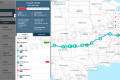
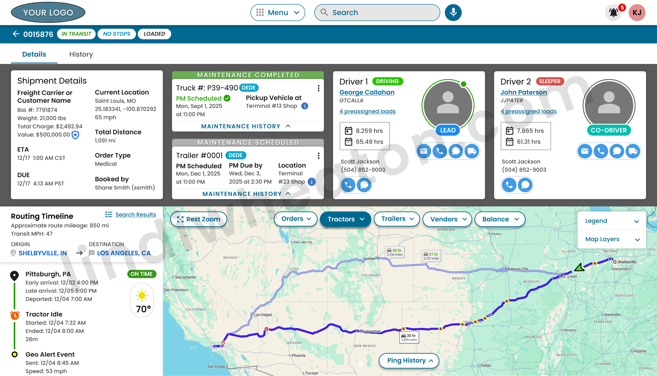
Live Map & Equipment View
Google Maps–powered live map with overlays for loads, tractors, trailers, and vendors. Filters allow teams to focus on specific lanes, geographies, or at-risk freight.
Order & Route Details
Single-page views show customer data, stops, drivers, equipment, temperature deviations, documents, and conversations in one place.
Driver Profiles & Utilization
Driver profiles aggregate assignments, history, hours, and paired drivers, giving managers visibility into capacity and performance.
Document Capture & Storage
Drivers upload receipts, PODs, and terminal documents via mobile apps, syncing directly into the dispatch system for faster settlements.
Freight Finder & Assignment
Managers search available freight, match loads to drivers, and send routing details straight to the driver app.
Role-Based Dashboards
Widgets surface the most critical information by role: at-risk loads, incidents, and utilization snapshots.
Strategy Improvements
Strategy focused on reducing “hunt time,” improving exception clarity, and creating consistent patterns that scale across teams and new features.
Before → After shifts
- Tool switching and fragmented context.
- Search didn’t match dispatcher language.
- Exceptions required “detective work.”
- Inconsistent UI patterns across modules.
- Unified dashboards + deep object pages.
- Leading identifiers supported in search.
- Risk states surfaced with clear next steps.
- Systemized components and reusable layouts.
Prioritization model
I used a simple rubric stakeholders could trust: prioritize improvements that reduce time-to-assign, prevent errors, and lower support load—validated by research + analytics.
- Frequency: daily / hourly task?
- Risk: does failure impact service, cost, or safety?
- Effort: can we ship quickly with high confidence?
- Signal: does GA4 show loops, drop-offs, or no-results?
This approach shifted discussions from “opinions about UI” to measurable operational impact and adoption.
UI & Components
To keep dense operational data readable and scalable, I built a UI kit of reusable components and interaction patterns. This reduced rework, improved consistency across modules, and accelerated engineering delivery.
Widget cards
Role-based dashboards use consistent widget anatomy: title, primary KPI, states, and action links.
Result rows
Search results surface disambiguation context (driver photo, unit #, status, current load) to reduce errors.
Exception states
Plain-language banners + color-coded severity help users understand risk and next action quickly.
Stop timelines
Order detail timelines mirror dispatcher mental models: stop sequence, ETA, status, and doc attachment points.
Quick filters
One-click filters reflect real language: “late”, “unassigned”, “missing POD”, “my loads today”.
Cross-links
Deep links connect loads ↔ drivers ↔ equipment ↔ documents so teams don’t lose context.
Key Screens & Interaction Highlights
Each screen balances dense operational data with a clean hierarchy so dispatchers and managers can make decisions quickly.
Search-log review: how dispatchers actually find loads
To understand how well the Dispatch Operations Platform supported real workflows, I instrumented in-app search behavior in GA4 — tracking what dispatchers typed, which entities they searched for (loads, drivers, equipment), how often they refined results, and where they encountered dead-ends. This search-log review informed concrete UI/UX changes to the load board, global search, and driver lookup patterns.
What I instrumented in GA4
I partnered with engineering to send structured, privacy-safe events from the Dispatch Operations Platform UI into GA4, so each search told a story about user intent and friction.
-
Custom events:
in_app_search,view_search_results,search_refine,search_no_results,filter_applied. - Key parameters: search_term, module (Load Board, Drivers, Equipment), entity_type, result_count, role (dispatcher, planner, support), time_to_first_result.
- Dimensions: session-level funnels for “search → refine → assign load” and “search → no_results → back navigation”.
Questions I set out to answer
Rather than just logging clicks, the goal was to tie behavioral data directly to design decisions.
- How are dispatchers actually searching for loads during busy windows?
- Which search terms and filters correlate with fast load assignment?
- Where do “no results” or repeated refinements signal findability issues?
- Do different roles (dispatch vs. night ops) use search in different ways?
These questions framed the GA4 explorations and ensured every chart mapped back to a UX decision.
Finding: Most dispatchers relied on the free-text search bar with lane shorthand (e.g., “CHI → ATL”) instead of the full filter panel, leading to long result lists and repeated refinements.
- High volume of lane-based queries; low adoption of advanced filters (equipment, home-time date).
- Sessions with 3+ refinements showed significantly longer time-to-assign.
- “No results” spikes when users searched by customer nickname instead of the official code.
I redesigned the load board header around dispatcher language — surfacing quick filters (“Near service failure”, “My loads today”, “Needs appointment”) and adding support for lane abbreviations and customer nicknames in the main search field.
Finding: Dispatchers often searched by driver first name or truck number only, which generated crowded result sets and frequent refinement when multiple drivers matched.
- Common patterns: “Mike”, “Chris”, and short unit IDs with no additional context.
- Repeat searches within the same session for the same driver, suggesting recall issues.
- High exit rate from results when multiple partial matches looked visually similar.
I introduced a consolidated “smart search” pattern that surfaces driver photo, status, current load, and truck number in a single row. I also added role-based quick filters (“My fleet only”, “On duty now”) to reduce clutter and speed up selection.
Finding: “No results” events clustered around specific phrases like “missing POD”, “unassigned”, and “late”, revealing that dispatchers were using search to find work queues rather than individual records.
- Clusters of “missing docs” searches during end-of-day billing windows.
- Repeated “unassigned” and “late” queries from night-ops roles.
- Users often backed out and manually navigated to separate work-queue screens.
I turned the most common failure phrases into dedicated queue shortcuts in the search empty state — e.g., “View loads missing PODs” and “View unassigned loads” — connecting search intent directly to actionable, filtered worklists.
Dispatch Retention — measuring repeat usage and real product value
Adoption shows initial interest. Retention proves the platform is valuable enough to bring dispatch teams back during real operational pressure. I used GA4 retention views and event-based cohorts to measure repeat usage across high-value workflows—load assignment, exception handling, and order visibility—so we could validate product value and prioritize UX improvements with confidence.
What “retention” means in GA4
Retention tracks the percentage of users who return after their first meaningful interaction. In GA4, that can be user retention (returning users over time) or event-based retention (returning after a key milestone event).
- Day 1 / Day 7 / Day 30 return rates to validate stickiness beyond launch week.
- Cohorts by role (dispatcher, planner, night ops) and terminal/region to find gaps.
- Engagement + retention together to confirm repeat use isn’t shallow or accidental.
How I measured “repeat value” for dispatch work
Dispatch work is time-sensitive. If the experience slows users down, they revert to spreadsheets, calls, or the legacy tool. I used retention to validate whether the platform became the default source of truth.
- Tracked repeat sessions after the first successful load assignment experience.
- Measured return usage after high-stress scenarios (late freight, exceptions, equipment changes).
- Compared returning behavior across roles to detect where the workflow still required training or support.
- Mapped retention shifts to design releases (search improvements, queue shortcuts, better status clarity).
Event-based retention cohorts (the way I made retention actionable)
Instead of only measuring “returned users,” I created cohorts based on the first completion of a critical workflow. That let us see whether the UI was strong enough for users to repeat the task without friction.
| Cohort anchor (first-time milestone) | Why it’s meaningful | What repeat behavior proved |
|---|---|---|
load_board_view → assign_load |
Represents a complete “find + match + assign” workflow. | Dispatchers returned to the platform as their primary assignment tool. |
order_details_view → exception_flag_view |
High-pressure scenario where clarity and speed matter most. | Users trusted the platform for recovery work—not just normal operations. |
in_app_search → view_search_results |
Measures findability and “time-to-answer” behavior. | Search became a reliable entry point instead of a frustration loop. |
doc_status_view → doc_task_complete |
Connects dispatch visibility to downstream back-office success. | Teams returned to manage documentation without off-platform follow-ups. |
What I found: Retention improved most when we reduced “hunt time” (search + filters), clarified at-risk states, and added fast work-queue shortcuts—so dispatchers could act in seconds, not minutes.
Monetization — using events to expose friction, improve flows, and find innovation opportunities
Even in an internal dispatch platform, “monetization” is real—measured as time saved, errors prevented, and support load reduced. I used GA4 events like a monetization model: track the workflows that create operational value, pinpoint where users stall or backtrack, and turn those signals into UX changes and innovation opportunities.
What I instrumented
- Workflow steps (view → search → refine → select → assign → confirm).
- Error + dead-end signals (
search_no_results, validation failures, canceled actions). - Time and effort indicators (refinement count, dwell time, repeated opens).
- Role + context parameters (terminal, shift type, load risk state).
What it revealed
- Where dispatchers “looped” (search-refine-repeat) instead of progressing.
- Which screens created decision confidence (fast exits = wrong hierarchy).
- Where exceptions created support load (calls, pings, manual notes).
- Which shortcuts predicted faster assignments and fewer errors.
How I used it
- Suggested UX changes tied directly to event evidence, not opinions.
- Prioritized fixes that reduced rework (clear defaults, validations, status clarity).
- Identified automation opportunities (smart queues, proactive alerts, prefilled actions).
- Flagged innovation ideas aligned to dispatch mental models (lane-first, work-queue intent).
Event-driven friction → UX changes → innovation opportunities
I built an event taxonomy that mapped to the real dispatch lifecycle. When events showed drop-offs, retries, and delays, I translated that into specific UI improvements and product opportunities that would reduce manual work.
| Workflow | Events tracked | Friction signals found | UX changes & innovation opportunities |
|---|---|---|---|
| Load assignment |
|
|
|
| Exceptions & recovery |
|
|
|
| Findability & work queues |
|
|
|
| Docs visibility |
|
|
|
Journey & Outcomes
The UX process is tightly aligned to dispatch, driver, and business outcomes.
End-to-End UX / UI Process
- Discover: Interviews, ride-alongs, system audits.
- Define: Journey maps and task flows.
- Design: Dashboards, live map layouts, profiles, modular components.
- Validate: Prototypes tested with dispatchers and driver managers.
- Deliver: Specs, UI kit, and design QA.
UX Improvements & Business Outcomes
| Area | UX Improvement | Impact | Status |
|---|---|---|---|
| Load Assignment | Unified view for loads, drivers, and availability. | +18% faster assignments. | In Production |
| Live Visibility | Map overlays + exception flags. | Earlier detection of at-risk loads. | In Production |
| Driver Support | Document capture & messaging. | Reduced calls and faster post-trip processing. | |
| Reporting | Dashboards for on-time performance. | Better decisions on lanes and staffing. | Planned |
Engineering Collaboration
The UI needed to reflect real system behavior (data timing, edge cases, and state changes). I partnered closely with engineers to define what “real-time” meant per data source, design for latency and partial data, and ship patterns that were feasible.
How we worked
- Mapped data sources + refresh timing per module (map, load board, order details).
- Defined state models (at risk, late, unassigned, docs missing) and how states transition.
- Created UI acceptance criteria and edge-case checklists for design QA.
- Aligned GA4 event taxonomy with actual UI states and engineering triggers.
Patterns that reduced build friction
- Reusable components: widget cards, banners, tables, empty states, result rows.
- Explicit loading/empty states: no “mystery blanks” when data is delayed.
- Progressive disclosure: dense context lives in details pages, not cluttering list views.
- Clear interaction contracts: what happens on search, refine, and queue shortcut.
Fewer ambiguous handoffs, faster iteration cycles, and UI behavior that matched the realities of the underlying systems.
Results & Impact
Centering the product around dispatcher workflows and live operational data produced meaningful improvements.
Operational Efficiency
- Unified toolset reduced context-switching.
- Live filters accelerated finding critical answers.
- +18% improvement in assignment speed.
Driver & Customer Experience
- Clearer communication reduced unnecessary phone calls.
- Mobile uploads accelerated settlements.
- More transparent experience for drivers and customers.
Scalability & Future Work
- Architecture supports additional teams and features.
- Usage analytics guide future reporting enhancements.
- Foundation for optimizing lane performance and planning.
Reflection
This project reinforced that operational UX succeeds when it respects real work pressure: partial info, interruptions, and high-stakes decisions. The biggest wins came from aligning UI language and entry points to dispatcher intent.
What worked best
- Leading identifiers: designing search around how users recall info.
- Queue intent: converting “no results” phrases into actionable worklists.
- Systemized UI: consistent patterns reduced cognitive load across modules.
- Analytics as UX evidence: GA4 connected behavior to prioritization.
What I’d push further next
- Smart recommendations: suggested driver-load matches to reduce hunt time even more.
- Shift-start task lists: role-based queue personalization by terminal and shift type.
- Proactive alerts: escalation rules tied to risk state transitions.
- More cohort slices: retention by workflow completion and training maturity.
Hire a UI/UX Designer who delivers results through research and prototyping
I design scalable, data-informed digital experiences that simplify complex workflows and drive measurable business outcomes. From research to high-fidelity design prototypes, I help product teams ship solutions that reduce friction, boost adoption, and perform reliably at enterprise scale.