Freight Carrier & Broker Operations Platform
Transforming carrier workflows with end-to-end digital efficiency
Enterprise carrier portal built to unify load tenders, real-time freight visibility, compliance documentation, and settlements into one seamless experience. As the Lead Senior UI/UX Designer, I guided the full product lifecycle—from discovery and workflow mapping to Figma system creation, accessibility standards, and analytics instrumentation.
One starting point where carriers see new tenders, in-transit loads, document status, and settlements—without digging through email.
Research & discovery
Methods
- Contextual interviews with carrier owners, dispatchers, and billing teams across fleets of different sizes.
- Workflow mapping with internal broker / carrier reps to understand handoffs from tender to invoice.
- Audit of legacy portals, spreadsheets, and email threads to see how work was really getting done.
Insights
- Most carriers were managing freight across 3–5 systems (email, spreadsheets, TMS, portals, WhatsApp).
- Key friction points were unclear tender requirements, missing docs, and unpredictable payment timelines.
- Carriers wanted reliable status and simple flows more than “features”—complex portals were abandoned.
Risks
- Different carrier types (asset, brokered, owner-operator) had different compliance and payment rules.
- Multiple legacy processes needed to co-exist during rollout; we couldn’t force “all or nothing” adoption.
- Trust in prior portals was low, so the new experience had to prove reliability quickly.
Problem
- Tenders, tracking, documents, and settlements lived in disconnected systems and email threads.
- Carrier onboarding and compliance reviews were slow, manual, and hard to track.
- Internal teams were flooded with basic status questions about loads and payments.
Goals
- Provide a single source of truth for carriers to manage tenders, execution, docs, and pay.
- Reduce email and phone dependency by surfacing self-service answers in the portal.
- Shorten time-to-onboard and time-to-pay while protecting compliance and data quality.
Carrier journey we designed around
Carrier receives an invitation and completes onboarding without sending PDFs back and forth.
- Guided onboarding checklist with clear requirements and real-time validation.
- Progress indicators for profile, insurance, and compliance items.
Carrier sees a prioritized list of new tenders aligned to lanes and preferred equipment.
- Saved search presets for lanes, rates, and timing preferences.
- High-signal badges for “best fit”, “expiring soon”, and “preferred partner”.
Carrier assigns a driver, accepts the tender, and aligns expectations with minimal friction.
- Side-by-side view of tender requirements and carrier’s driver/equipment roster.
- Inline checks for appointments, detention rules, and accessorials.
Real-time tracking connects execution with what ops teams see in the TMS.
- Status updates, ETAs, and exceptions aligned to stops and reference numbers.
- Document tasks triggered by events (arrival, loaded, delivered).
Carrier uploads documents, submits the invoice, and tracks payment without calling in.
- Guided invoice submission with required docs and fields clearly called out.
- Payment timeline, statuses, and remittance history visible in one place.
User journey map — steps & emotions
Observed emotions during moderated tests and pilot launch across core carrier tasks.
Carrier logs in to see what needs attention right now.
- Dashboard highlights new tenders, loads at risk, and invoices needing docs.
- “Today vs Upcoming” split reduces scanning across multiple tables.
Carrier reviews rate, lane, requirements, and accessorial rules.
- Tender details call out requirements, time windows, and penalties clearly.
- Lane and margin calculators help evaluate fit quickly.
Carrier assigns a driver/equipment and accepts the load.
- Early tests surfaced confusion around appointment dependencies.
- We simplified the accept flow and added inline validations and helper text.
Post-delivery, carrier uploads POD and supporting paperwork.
- Document task list makes it obvious what’s missing vs complete.
- Drag-and-drop, bulk upload, and auto-tagging reduce manual sorting.
Carrier submits invoice and confirms settlement details.
- Guided invoice form with validation before submission.
- Instant confirmation with expected payment date and remittance method.
Carrier monitors open, paid, and disputed invoices.
- Payment status filters and exports for finance teams.
- Less guesswork and fewer “Where’s my money?” calls.
Dispatcher-ready order intelligence
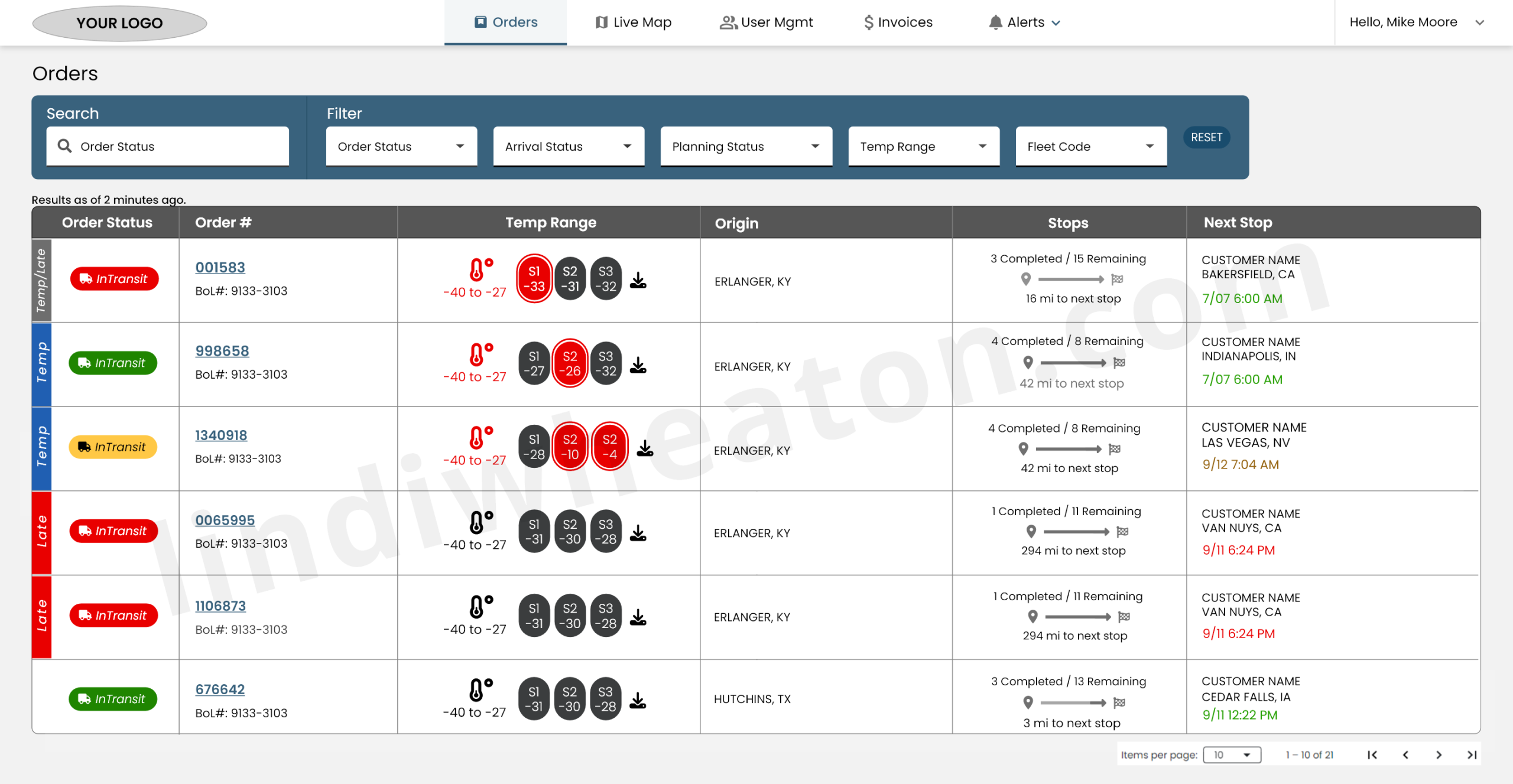
Real-time orders overview
The Orders table centralizes real-time shipment visibility with clear status signals, temperature monitoring, and stop progression in a clean, dispatcher-friendly layout.
- One unified view of all active, in-transit, late, and completed orders.
- Real-time data including temperature probes, stop counts, and next ETA.
- Search + multi-filters for order status, arrival status, fleet, planning status, and temperature range.
- Clickable order numbers reveal full order details, stops, and documents.
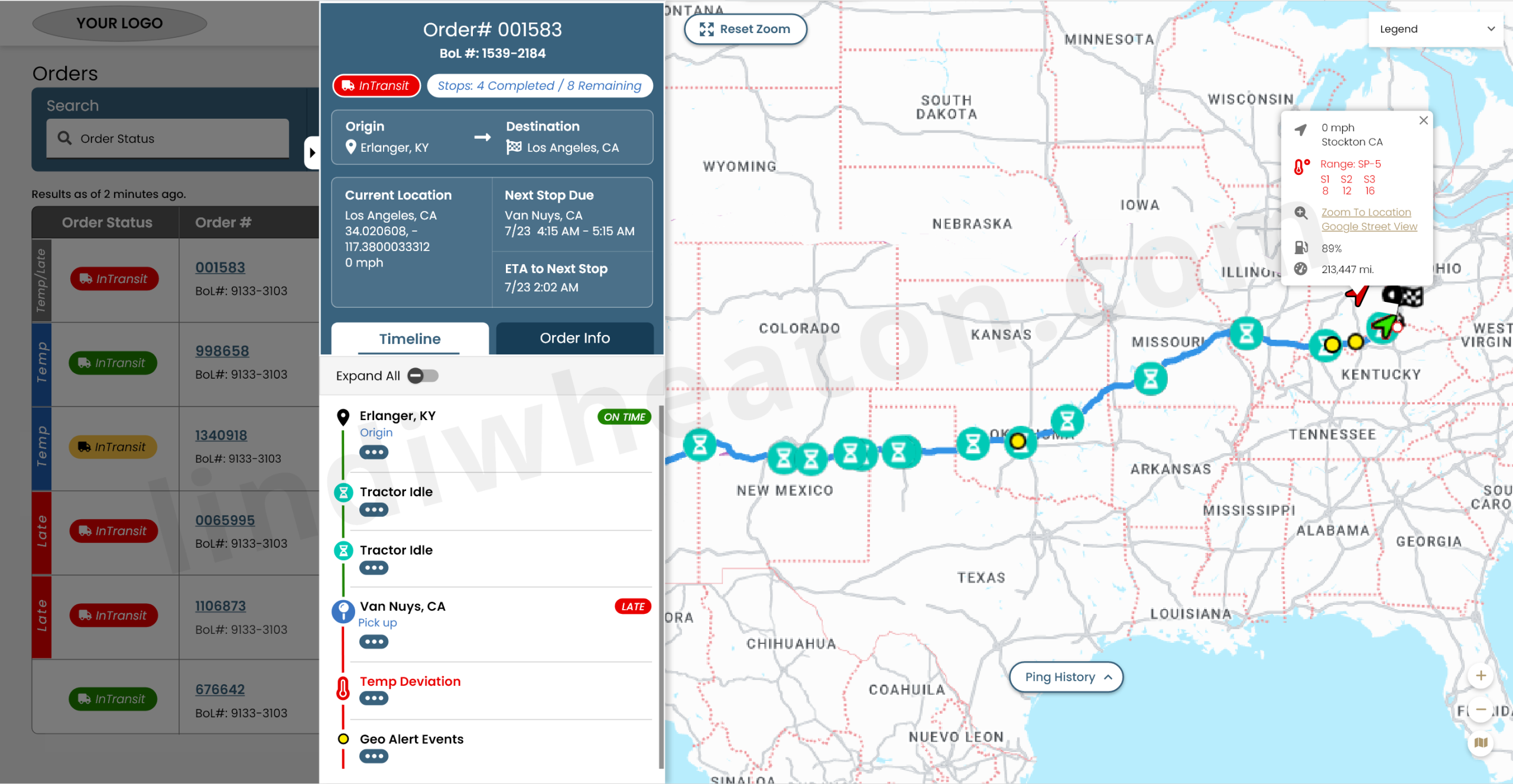
Order details slideout
The order slideout brings together the timeline, live map, and load documents in a single, high-signal panel— giving dispatchers everything they need to troubleshoot, track progress, and communicate with customers.
- Chronological events: origin, pickups, arrivals, idle, detention, deviations.
- Visual route progression with ETA markers and late/at-risk indicators.
- Real-time truck location, speed, and ping history.
- Quick access to BOL, POD, and required compliance docs.
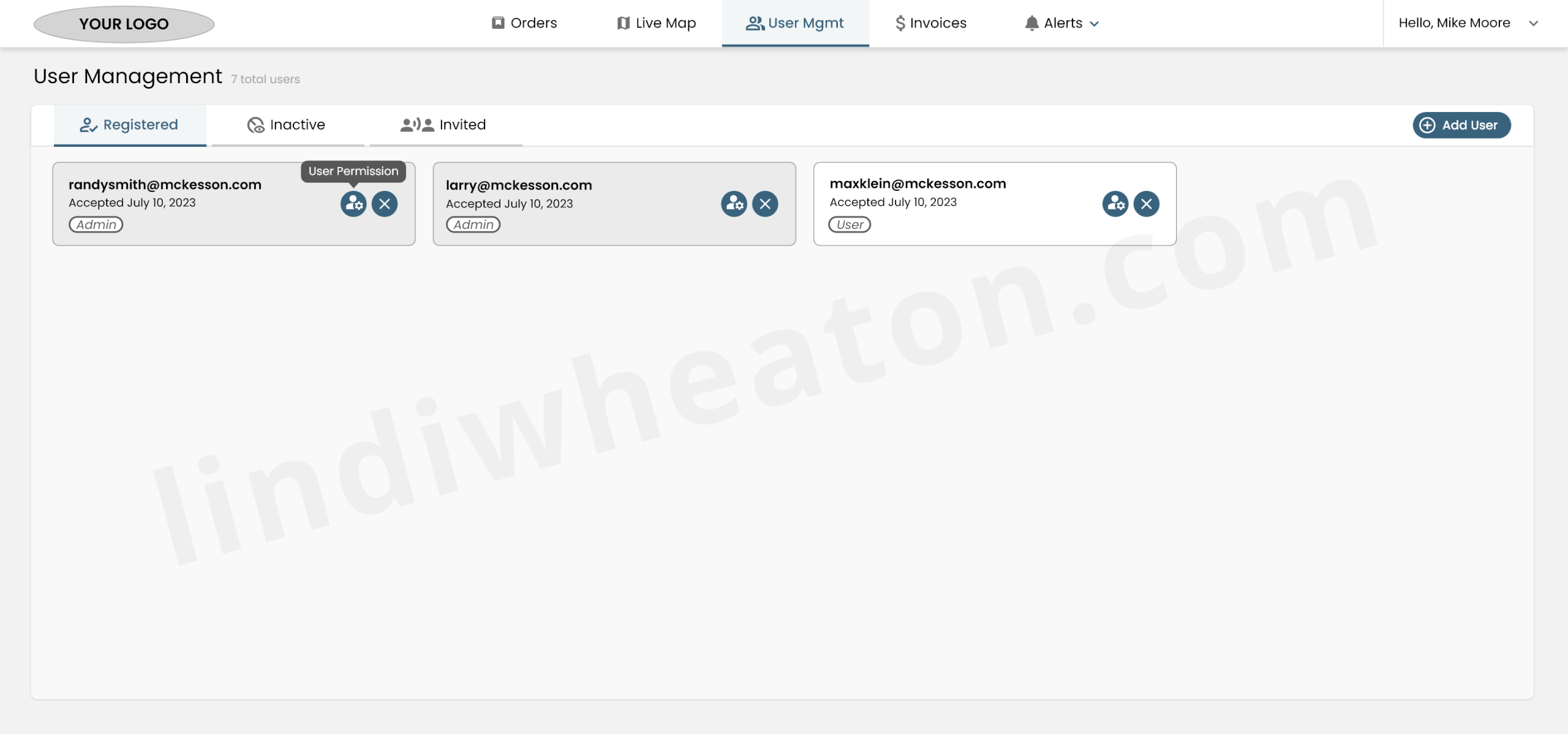
User management
The User Management area gives carrier admins complete control over account access with a simple, organized interface.
- Displays all active users with accepted invitations.
- Shows acceptance date for audit clarity.
- Role-based access (Admin, User) with clear visual tags.
- Confirmation prompt prevents accidental deletion.
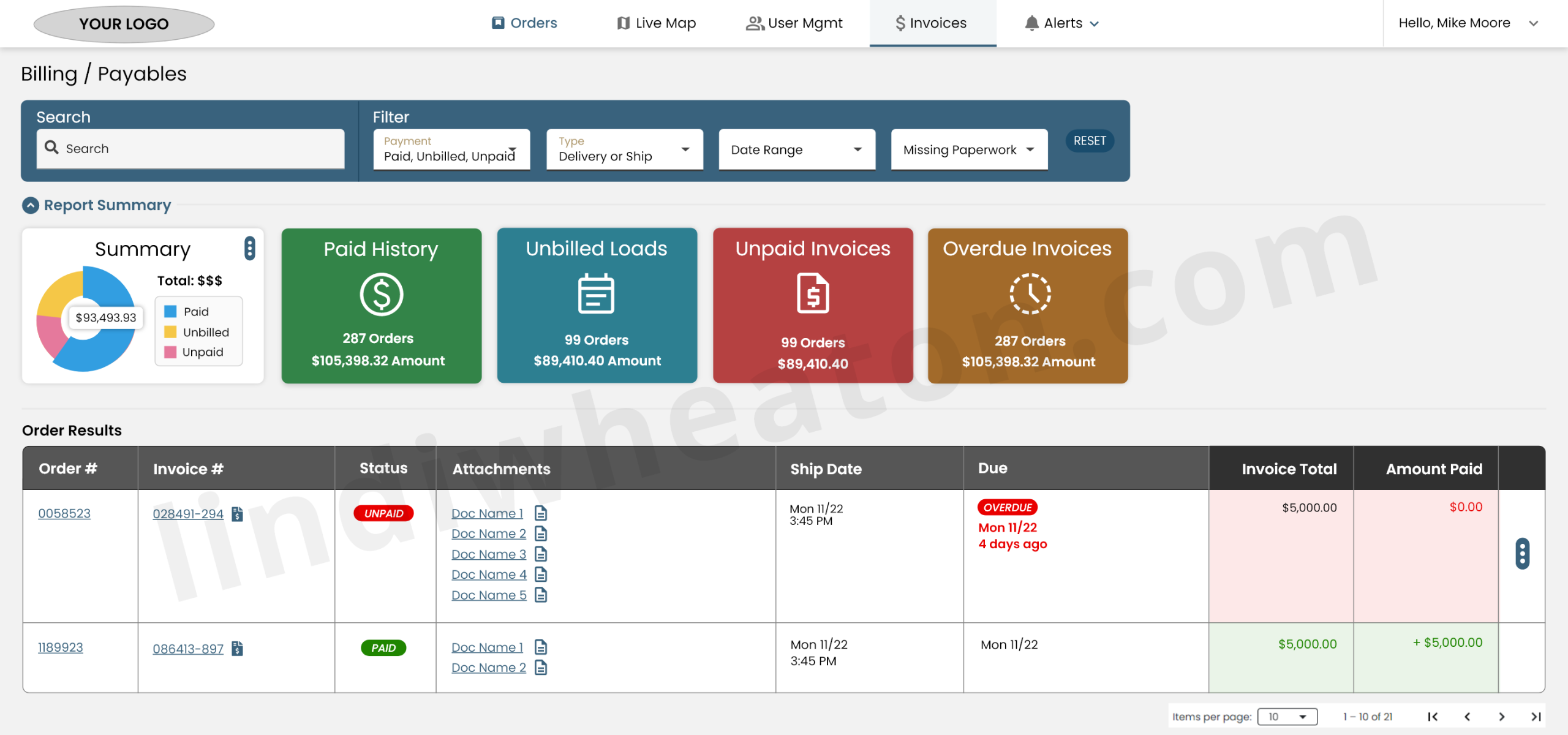
Invoices & billing
The Billing / Payables workspace gives carriers a transparent, organized view of all financial activity—from paid invoices to unbilled loads and overdue payments.
- Universal search bar to quickly locate orders, invoices, or customers.
- High-level dashboard summarizing the carrier’s financial posture.
- Interactive pie chart for Paid, Unbilled, and Unpaid amounts.
- Expandable rows allow quick access to attached documents (PODs, BOLs, invoices).
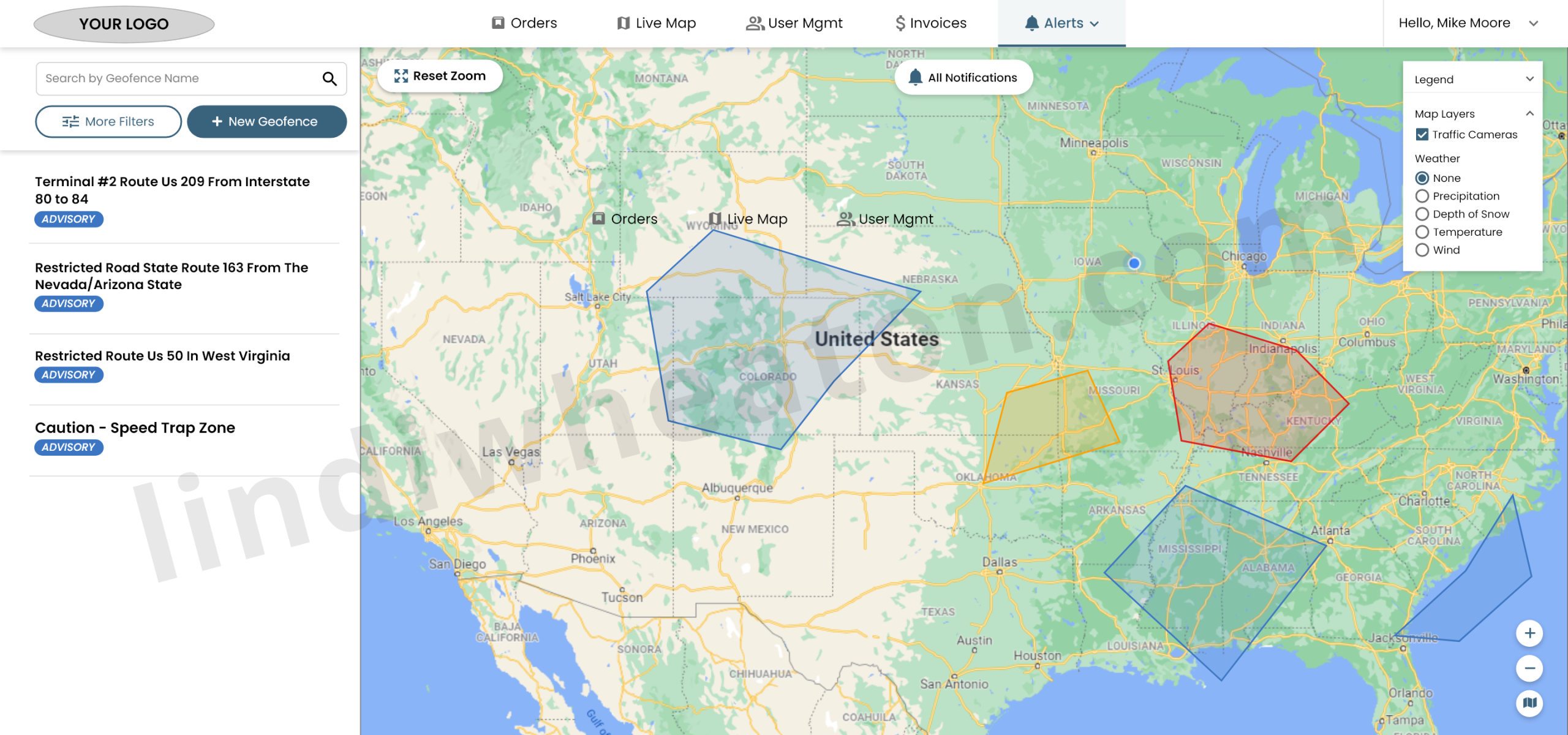
Alerts & geofences
Geofence Alerts allow operations teams to create custom safety, compliance, and routing zones directly on the live map.
- Users can draw custom polygon shapes directly on the live map.
- Flexible drag-and-drop anchors support irregular boundaries.
- Reduces risk by flagging dangerous or restricted routes early.
- Weather, traffic cameras, and map layers can be toggled for deeper context.
Analytics, events & feedback loops
To measure impact and guide iterations, I defined an event model for GA4 and created dashboards aligned to carrier and operations KPIs.
| Area | Key events | What we measured |
|---|---|---|
| Dashboard & orientation |
|
|
| Tenders & loads |
|
|
| Docs & invoices |
|
|
| Payments & issues |
|
|
Qualitative feedback from carrier councils and in-portal surveys guided the roadmap: better lane presets, multi-user carrier accounts, and clearer payment timelines.
End-to-end UI/UX journey & outcomes
The portal is structured around the real lifecycle carriers run every day. Each stage of the journey has explicit UX improvements tied to measurable outcomes.
| Journey stage | UX improvements | Impact & KPIs |
|---|---|---|
| Onboard & profile | Guided onboarding checklist with progress indicators, structured company profile and contact roles, and real-time validation on required fields and docs. |
|
| Tenders & assignment | Prioritized tender list with filters, badges, and lane presets; side-by-side assignment flow that surfaces requirements before acceptance. |
|
| Docs & compliance | Per-load document tasks, drag-and-drop uploads, status chips, and automated reminders for missing items. |
|
| Invoices & pay | Structured invoice submission, payment status views, and a simple “Dispute / ask question” flow tied to specific loads and invoices. |
|
Dispatch Retention — measuring repeat usage and real product value
Retention is one of the clearest signals that the platform is valuable enough to bring dispatchers and ops teams back. It validates UX quality, workflow clarity, and real “stickiness” beyond initial rollout and training.
What retention means (plain English)
Retention shows the percentage of users who return after their first visit—or after their first key event (like creating a tender, updating a load, or submitting documents).
What it measures
- Repeat usage over time after a first session
- Or after a first key workflow milestone (event-based retention)
- Behavior patterns by cohort (role, fleet, lane, account type)
Why it matters
- UX quality (is it easy enough to use again?)
- Workflow value (does it save time or reduce effort?)
- Product stickiness (do users rely on it daily?)
- Training effectiveness (do users come back without support?)
Where it lives in GA4
- Reports → Life cycle → Retention
- User retention by cohort
- Retention over time (Day 1 / Day 7 / Day 30)
- User engagement trends alongside retention
How GA4 calculates retention
GA4 groups users into cohorts based on when they first interacted, then tracks whether they return.
| Cohort timeline | Question GA4 answers |
|---|---|
| Day 0 | Dispatcher uses the platform for the first time. |
| Day 1 | Did they come back the next day? |
| Day 7 | Did they return within a week? |
| Day 30 | Did they return within a month? |
How I used retention in this platform
- Validated whether new workflows reduced friction enough for repeat daily usage.
- Compared cohorts by role (dispatch vs billing vs compliance) to find where training or UX broke down.
- Used event-based retention after key milestones (first tender acceptance, first doc upload, first invoice submit).
- Connected retention shifts to UI changes (navigation, table density, filters, status visibility).
Monetization — using events to expose friction, improve flows, and find innovation opportunities
I used GA4 monetization-style thinking to connect user behavior to business outcomes—instrumenting critical workflows (tenders, documents, exceptions, invoicing, and settlement tracking) to identify friction, recommend UX changes, and uncover innovation opportunities that reduce manual work and support load.
What I tracked
- Step-by-step completion and drop-off across high-value workflows.
- Retries, backtracks, and error states that signal unclear UI.
- Time-to-complete and time-between steps (process latency).
- “Help-seeking” behavior (support links, exports, repeated refresh/filter loops).
What I found
- Where dispatchers stalled (dense tables, unclear statuses, missing inline guidance).
- Where carriers and internal teams dropped out (doc errors, invoice completeness, payment clarity).
- Which features created repeat usage vs one-and-done behavior.
- Which steps generated downstream support load (emails, calls, exceptions).
How I turned it into action
- Suggested UX changes tied to specific event evidence (not opinions).
- Prioritized fixes that reduce rework (validation, inline checks, better defaults).
- Proposed automation opportunities (smart tasks, reminders, prefilled forms).
- Identified product innovation (self-service workflows, proactive alerts, offline-safe patterns where needed).
Event-driven process tracking (how I exposed friction + uncovered innovation)
I created an event taxonomy to track each process step. When I saw drop-offs, retries, or long time-to-complete patterns, I used those insights to recommend workflow improvements and propose innovation opportunities.
| Workflow | Events I instrumented | What it revealed | UX changes & innovation opportunities |
|---|---|---|---|
| Tender review → acceptance |
|
|
|
| Docs upload → invoice ready |
|
|
|
| Payments → issue resolution |
|
|
|
Accessibility & inclusive design
| Area | Standard | Status | Notes |
|---|---|---|---|
| Color & contrast | WCAG 2.2 AA | Met | High-contrast table and card themes; all text & data viz meet AA contrast. |
| Keyboard navigation | 2.1.1 | Met | Core flows (tenders, docs, invoices) are keyboard-navigable with visible focus states. |
| Semantics & labels | ARIA / HTML | Met | Tables, filters, and action buttons use semantic markup and descriptive labels. |
| Responsive behavior | WCAG 1.4.10 | Met | Portal adapts across laptop, large monitors, and tablets without horizontal scroll traps. |
| Error handling | 3.3.x | Met | Inline errors explain issues in plain language; summary errors help in dense forms. |
| Future improvements | Robustness | Review | Planned work on table personalization and preferences for low-vision users. |
Design system highlights
Color & density
Brand and accent colors tuned for long hours in front of monitors, with AA contrast for dense data tables and card-based summaries.
Typography & layout
Type scales and spacing optimized for ops and finance users who live in the portal. Sticky headers, frozen columns, and responsive tables keep critical data visible.
Components & states
Status chips, alert banners, task lists, and data cards built as reusable Figma variants to support new workflows without re-inventing the UI.
Hire a UI/UX Designer who delivers results through research and prototyping
I design scalable, data-informed digital experiences that simplify complex workflows and drive measurable business outcomes. From research to high-fidelity design prototypes, I help product teams ship solutions that reduce friction, boost adoption, and perform reliably at enterprise scale.