Bluefield College
Rebuilding the Student Journey for Usability and Impact
A complete re-architecture of Bluefield College’s web experience—from program discovery and cost transparency to admissions and financial aid—built on a scalable design system and validated through iterative testing.

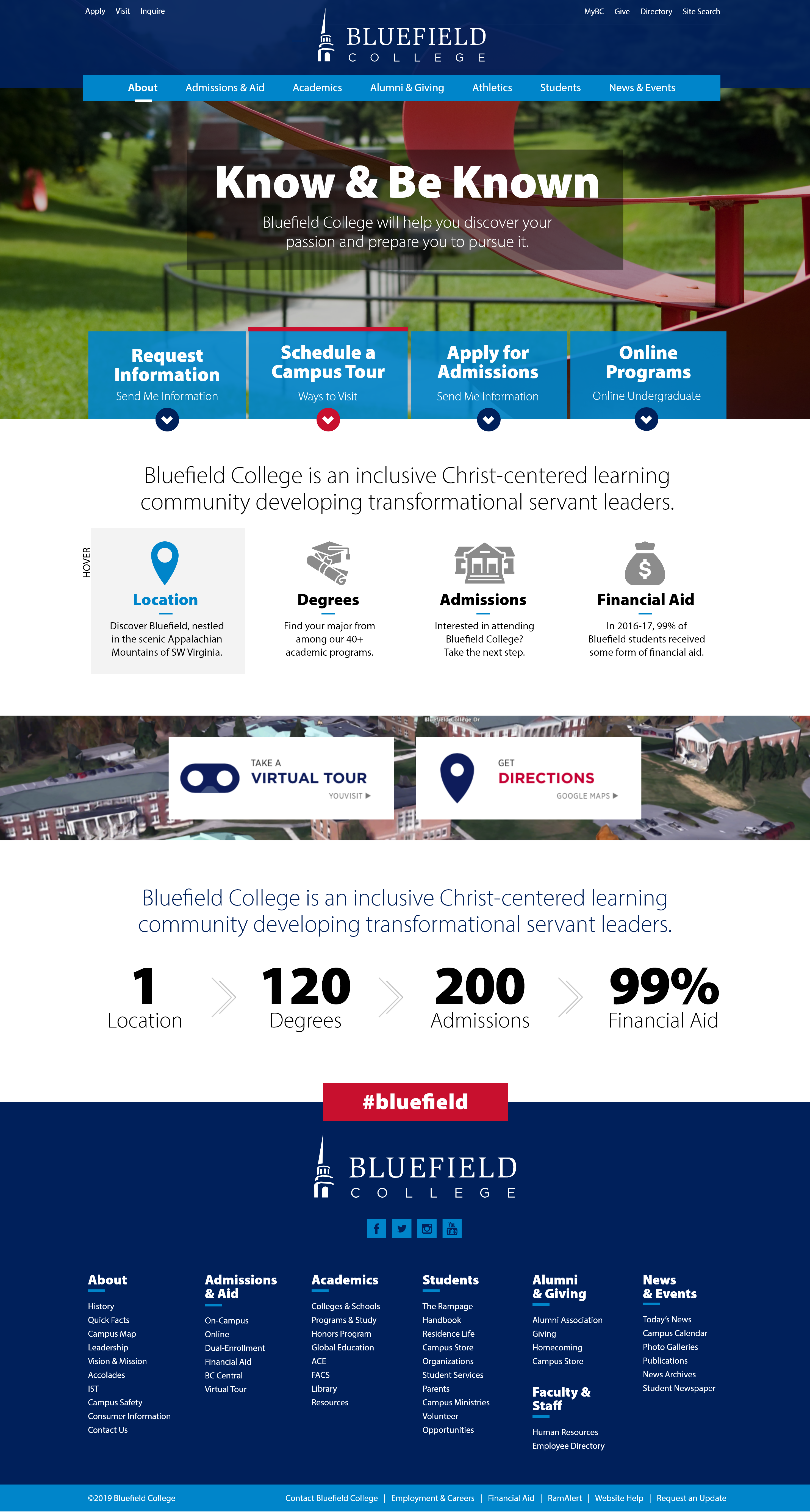
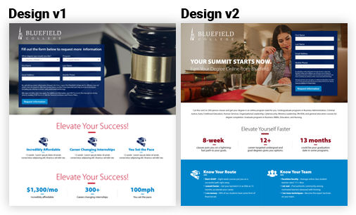
Bluefield College — Website Redesign
Bluefield College — UI/UX Journey Map
Research & Discovery
Interviews and analytics exposed duplicated labels, long click paths, and unclear requirements.
- 18 student + 6 parent interviews (prospects, transfers)
- Stakeholder sessions (Enrollment, Marketing, Academics)
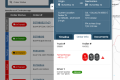
- GA4 funnel review & search-log audit; Hotjar scroll/click
Information Architecture & Strategy
Consolidated navigation and introduced a task-first model with clear entry points to Explore, Visit, and Apply.
- Sitemap & unified degree taxonomy (major/minor/certificate)
- User flows for Explore → Compare → Requirements → Apply
- Content governance & authoring guidelines
Wireframing & Prototyping
Prototypes validated filters, CTAs, and in-page navigation across breakpoints.
- Low-fi → high-fi wires; clickable prototypes
- Filter patterns (degree, school, delivery, interest)
- Early a11y checks; tap-target audits
Visual Design & Interaction
Tokenized system for color, type, spacing; reusable templates and micro-interactions with reduced-motion support.
- Design tokens & components (cards, tables, CTAs)
- Anchored sections, sticky CTAs, in-page nav
- Contrast QA, focus rings, keyboard parity
Testing, Iteration & Launch
Three moderated rounds informed labels, content density, and visual hierarchy; launch monitored via GA4.
- 3× moderated tests (n=16) + post-launch analytics
- Design QA with dev; Storybook mapping
- Author training: alt text, headings, link purpose
Bluefield College — Results & Impact
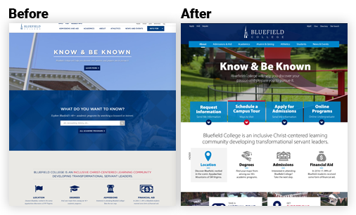
What changed
A complete rebuild centered on usability and enrollment growth. Unified navigation and guided program discovery paired with anchored templates for Outcomes, Careers, and Cost & Aid created a consistent exploration experience. The redesigned system scaled across Programs, Admissions, and Financial Aid, improving clarity, reducing time-to-task, and strengthening content authoring consistency.- Comprehensive website redesign focused on clarity, accessibility, and enrollment growth.
- Lead generation webpages built to capture inquiries and guide users to key conversion points.
- Unified degree taxonomy and filter model across schools and delivery modalities.
- Program templates with anchored sections (Overview, Outcomes, Careers, Cost & Aid, FAQ).
- Admissions workflows with checklists, “What you’ll need,” and sticky CTAs for next-step visibility.
- Design system tokens and reusable components mapped to Storybook for dev parity.
- WCAG-aligned color, type, focus, and keyboard patterns for inclusive design compliance.
End-to-End UI/UX Journey & Outcomes
| Journey Stage | Before | After | Impact |
|---|---|---|---|
| Discovery Problem Framing | Anecdotal decisions; unclear KPIs. | Scenario-based KPIs; prioritized success metrics. | Faster scoping · fewer pivots. |
| IA Navigation & Flows | Deep menus; duplicated labels. | Task-first IA; breadcrumbs; clear entry points. | Time-to-task ↓ · wayfinding ↑. |
| Design System & Patterns | One-offs; inconsistent CTAs. | Tokenized components; responsive templates. | Delivery speed ↑ · defects ↓. |
| Validation Usability & Data | Limited evidence; unclear adoption risk. | 3× moderated tests; GA4 funnels, heatmaps. | Confidence ↑ · targeted backlog. |
| Accessibility Compliance | Low contrast; hidden focus; small targets. | AA contrast; visible focus; 44px+ targets. | Mobile completion ↑ · AA achieved. |
Outcomes & Measurable Results
Within the first 90 days post-launch, engagement increased and friction decreased across key journeys.
| Metric | Before | After | Result |
|---|---|---|---|
| Task Completion — “Find a Program” | 58% | 85% | +27 pts completion |
| Financial Aid — Task Completion | 64% | 79% | +15 pts completion |
| Apply Now Click-through (site-wide) | 2.1% | 2.6% | +24% relative lift (+0.5 pts) |
| Program Page Engagement (avg. time on page) | 1:12 | 1:25 | +18% time on page |
| Authoring Efficiency | Unstructured blocks | Reusable templates | −30–40% update time |
Sources: GA4 events, Hotjar scroll/click maps, moderated usability tests (3 rounds, n=16), author survey.
UX Improvements Matrix
| Area | Before | After | Impact |
|---|---|---|---|
| Homepage Hero & CTAs | Competing CTAs; unclear priority actions. | Primary/secondary hierarchy; task chips (Explore, Visit, Apply). | Task starts ↑ into Programs & Admissions. |
| Programs Findability | Long alphabetical lists; inconsistent naming. | Facet filters (degree, school, modality, interest). | Clicks ↓ to detail; filter use ↑. |
| Templates Reuse | One-offs; layout shift. | Locked templates; sticky CTAs; anchored nav. | Consistency ↑ & governance. |
| Performance Media | Unoptimized images; CLS spikes. | Defined sizes; lazy-load; WebP policy. | Core Web Vitals ↑ · smoother scroll. |
UX Actions & Measurable Impact
| UX Action | Impact / Outcome |
|---|---|
| Streamlined complex student pathways—Programs, Admissions, Financial Aid, and Transfer—by aligning content and navigation to measurable UX goals. | Reduced friction across high-traffic pages; improved clarity, conversion, and mobile task flow. |
| Rebuilt the information architecture around student intent and unified degree taxonomy and filters across schools and delivery modalities. | Faster program discovery and stronger cross-linking between academic offerings. |
| Designed modular program templates with anchored sections—Overview, Outcomes, Careers, Cost & Aid, and FAQ—for scannability and transparency. | Simplified content consumption and improved comprehension across desktop and mobile. |
| Redesigned admissions workflows with guided checklists, “What you’ll need” steps, and persistent sticky CTAs. | Decreased drop-offs; improved completion rates and applicant confidence. |
| Built a tokenized, accessible design system mapped to Storybook for consistent component parity between design and development. | Accelerated prototype-to-dev handoff; fewer defects and faster sprint velocity. |
| Applied WCAG-aligned color, typography, focus, and keyboard patterns across templates. | Achieved AA compliance and enhanced usability for all students and devices. |
| Validated design decisions through moderated usability testing measuring task success, time-to-task, and error rates (SUS benchmarks). | Data-driven refinements led to measurable gains in satisfaction and confidence. |
| Refined filtering, labeling, and in-page navigation to minimize cognitive load and prevent dead-ends during exploration. | Clearer paths, higher engagement, and more intuitive content discovery. |
| Delivered an inclusive, mobile-optimized experience validated through iterative testing and stakeholder feedback. | Improved accessibility scores, task completion, and student trust in the digital experience. |
Accessibility Compliance Checklist
| Criterion | Before | Fix | Status |
|---|---|---|---|
| Contrast AA (1.4.3) | Buttons/links below 4.5:1; low-contrast body text. | AA palette tokens; contrast checks across UI + text. | AA Pass |
| Landmarks Semantics | Div soup; missing headings/landmarks. | H1–H3 hierarchy; header/nav/main/footer roles. | Implemented |
| Keyboard Focus | Hidden focus; no skip link. | Visible focus ring; skip to content; logical tab order. | Implemented |
| Images Alt text | Descriptive vs decorative not separated. | Meaningful alt; decorative images set to empty alt. | Implemented |
| Forms Labels & Errors | Placeholder-only labels; generic errors. | Explicit labels; aria-describedby; inline errors. |
Implemented |
Schedule a Meeting with Lindi
Interested in collaborating or need help improving your user experience? I work with universities and businesses to design interfaces that drive measurable results.