Fort Lewis College

Fort Lewis College

Duration: 11 months (Mar 2018– Jan 2019)     •     Timeline: 10-week sprint cycle     •     Project Length: 11 months
Portfolio Case Study — Higher Education

Reducing friction from discovery to decision

As a Senior UI/UX Product Designer, I help colleges turn sprawling content into intuitive paths. For Fort Lewis College, I led research, IA, design system, and validation to improve program discovery, admissions clarity, and accessibility across devices.
Fort Lewis College
2 yrs
Higher-ed UX and Website Designer
End-to-End
Research → Launch
College • University
Complex website simplified
Featured Case

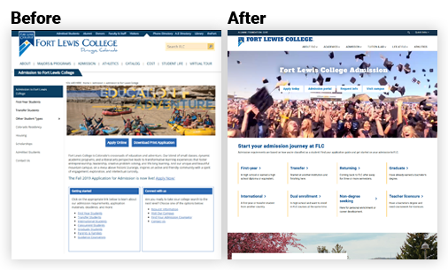
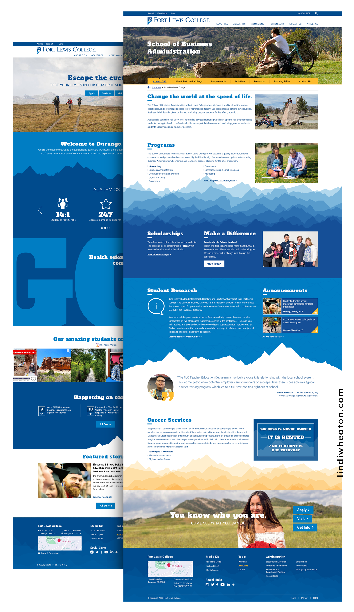
Fort Lewis College — Website Redesign

I owned the experience end-to-end: aligning enrollment, marketing, and academic stakeholders; simplifying information architecture; building a tokenized design system in Figma; and validating the result with moderated tests. I partnered with a PM on KPIs, worked daily with front-end engineering on component fidelity, and coordinated content governance with the marketing team. My unique contribution: converting a fragmented “Find a Program” journey into a guided discovery flow with consistent taxonomy, filters by degree/modality, and scannable program templates with anchored sections and sticky CTAs.
End-to-End Journey

Fort Lewis College — UI/UX Journey Map

1

Research & Discovery

Mapped how prospects, parents, and transfers search and decide. Quant + qual revealed duplicate labels, long click paths, and unclear cost/requirements.

  • 26 user interviews (prospects, parents, transfers, first-gen)
  • 8 stakeholder sessions (Enrollment, Marketing, IT, Academics)
  • GA4 funnel & search-log audit; Hotjar click/scroll heatmaps
2

Information Architecture & Strategy

Consolidated deep menus; introduced task-first navigation and contextual breadcrumbs. Established a unified taxonomy for degrees, certificates, and modalities.

  • Sitemap & taxonomy rationalization
  • User flows for Explore Programs → Compare → Requirements → Apply
  • Content model & governance (authoring rules, lockable blocks)
3

Wireframing & Prototyping

Iterated low-fi to high-fi with interactive prototypes covering mobile-first breakpoints and priority tasks.

  • Wireframes → clickable prototypes (mobile, tablet, desktop)
  • Filter patterns (degree, school/college, delivery, interest)
  • Early a11y checks; content density and tap-target audits
4

Visual Design & Interaction

Built a tokenized system for color, type, spacing, and elevation; defined reusable program templates and micro-interactions with reduced-motion alternatives.

  • Design tokens & component variants (cards, tables, CTAs)
  • Anchored sections, sticky CTAs, in-page nav & “Back to Top”
  • Contrast QA, focus rings, and keyboard parity
5

Testing, Iteration & Launch

Conducted 3 moderated rounds; tuned filters/labels, elevated key CTAs, and refined authoring guardrails. Handoff included specs, redlines, and a governance guide.

  • 3x moderated tests (n=18) + post-launch GA4 monitoring
  • Design QA with Dev; token handoff + Storybook mapping
  • Author training: alt text, headings, link purpose, tables
Outcome

Fort Lewis College — Results & Impact

+27%
Apply Now clicks
Clearer IA & CTA placement
-36%
Time to find a degree
Guided filters & taxonomy
+21%
Program page engagement
Scannable templates
AA
WCAG compliance
Contrast, focus, semantics

Measured in first 90 days post-launch (GA4, Hotjar). “pts” = percentage points; “%” = relative change.
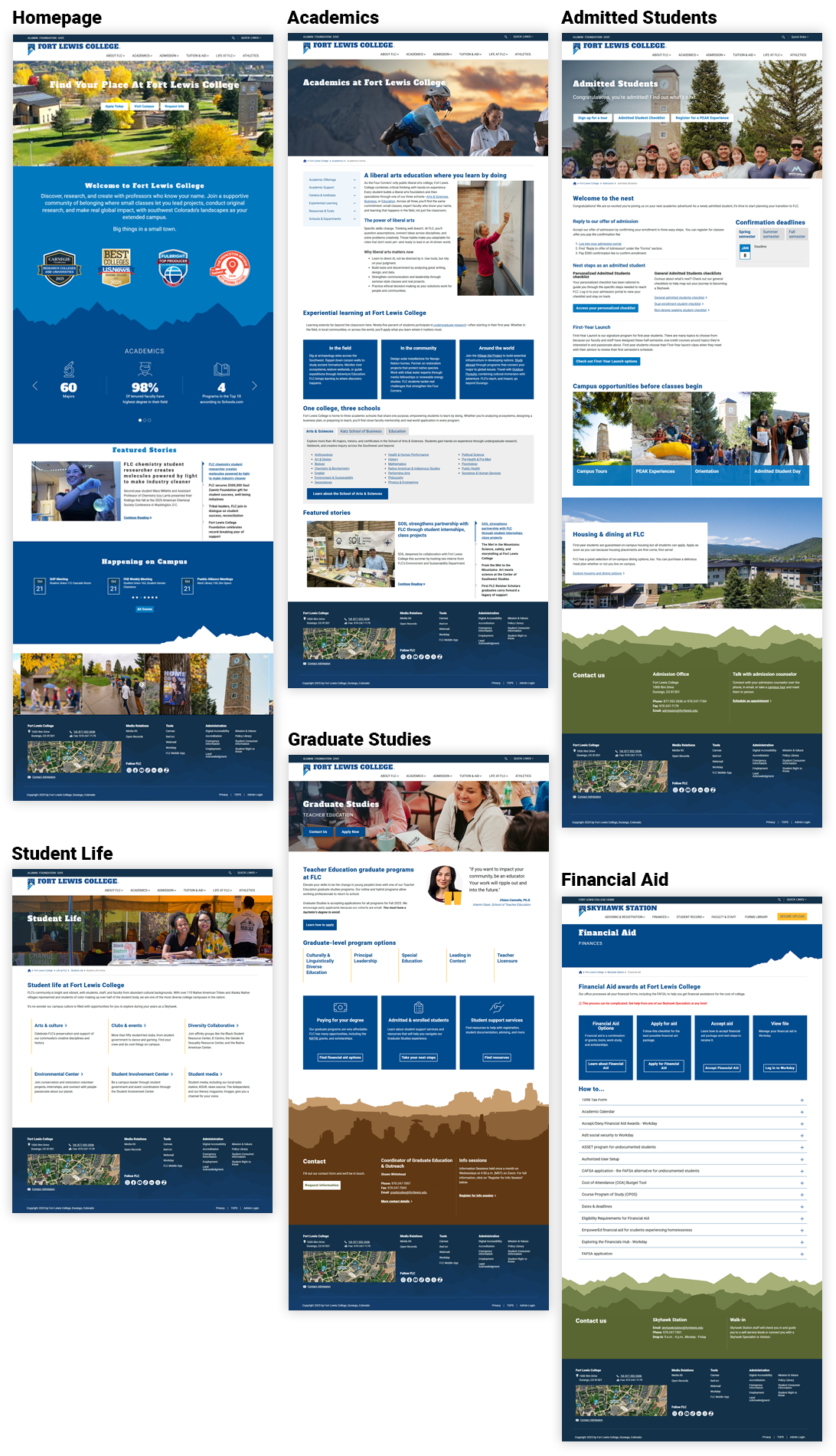
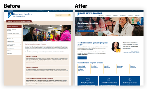
Overview of redesigned pathways and templates (FLC)
Unified filters, anchored navigation, and consistent layouts introduced across key sections — Programs, Student Life, Graduate Studies, Financial Aid, Academics, and Admitted Students — improving clarity and helping prospective students explore pathways with confidence.
Task Completion — “Find a Program” +31
Find a Program before/after (FLC)
Completion improved after introducing guided filters, unified taxonomy, and anchored templates.
Before — fragmented browse
55%
After — guided filters + anchored sections
86%
Bounce — Admissions > Requirements -16
Admissions Requirements before/after (FLC)
Requirements clarified with in-page nav & CTAs.
Before
76%
After
60%

What changed

  • Unified degree taxonomy and filter model across colleges, departments, and delivery modalities, helping prospective students quickly compare majors and discover related programs.
  • Introduced dynamic program templates featuring hero stats, learning outcomes, faculty highlights, and anchored in-page sections to promote easy scanning and transparent academic value.
  • Redesigned admissions workflows with guided steps, “What to Expect” timelines, and persistent sticky CTAs—simplifying complex requirements and increasing application flow efficiency.
  • Developed a tokenized design system aligned with brand standards, mapping components to Storybook for seamless handoff and visual consistency across marketing and academic pages.
  • Collaborated closely with content and accessibility teams to ensure WCAG-compliant typography, structured content hierarchy, and responsive layouts optimized for student devices.
End-to-End

End-to-End UI/UX Journey & Outcomes

Journey Stage Before After Impact
Discovery Problem Framing Competing priorities; no shared KPIs; anecdotal decisions. KPI-backed scenarios; prioritized success metrics; test plan. +Faster scoping · fewer pivots; clearer PRDs.
IA Navigation & Flows Deep menus, duplicate labels; long time-to-task. Task-first IA; breadcrumbs; guardrails for authoring. −36% time-to-find program; improved wayfinding.
Design System & Patterns One-off blocks; inconsistent CTAs; rework across pages. Tokenized components; locked styles; responsive templates. +Delivery speed · fewer defects; easier governance.
Validation Usability & Data Limited evidence; unclear adoption risks. 3x moderated tests; GA4 funnels; heatmaps for iterating. +Confidence at launch; targeted backlog.
Accessibility Compliance Low contrast; hidden focus; placeholder “labels”. AA contrast; visible focus; labeled forms; skip links. AA achieved; improved mobile completion.

Outcomes & Measurable Results

Within the first 90 days post-launch, engagement rose and friction dropped across key decision journeys.

Metric Before After Result
Task Completion — “Find a Program” 55% 86% +31 pts completion
Bounce Rate — Admissions > Requirements 76% 60% −16 pts bounce
Apply Now Click-through (site-wide) 2.2% 2.8% +27% relative lift ( +0.6 pts )
Program Page Engagement (avg. time on page) 1:18 1:35 +22% time on page
Authoring Efficiency Unstructured blocks Reusable templates −30–40% update time (editor survey + Jira cycle time)

Sources: GA4 events (apply_now_click, view_program_detail, search_results_view), Hotjar scroll/click maps, moderated usability tests (3 rounds, n=18), and author survey (n=7).

UX Improvements Matrix

AreaBeforeAfterImpact
Homepage Hero & CTAs Competing CTAs; unclear priority actions. Primary/secondary hierarchy; task chips for Explore, Visit, Apply. +Task starts into Programs & Admissions.
Programs Findability Long alphabetical lists; inconsistent naming. Facet filters (degree, college, modality, interest clusters). −Clicks to detail; higher filter use.
Templates Reuse One-offs; layout shift. Locked templates with set ratios; sticky CTAs; anchored nav. +Consistency & governance; fewer regressions.
Performance Media Unoptimized images; CLS spikes. Defined sizes, lazy-load, WebP decision tree. +Core Web Vitals & smoother scroll.

Improvements Mapped to Outcomes

Evidence-driven changes tied to student problems and measurable impact.

UX Area Problem / Insight Improvement Intended Impact
Navigation Students missed Programs & Cost due to deep menus and duplicate labels. Consolidated IA; context breadcrumbs; “Explore Programs” entry points. Faster wayfinding; higher task starts.
Admissions Requirements were buried; no single path from interest → apply. In-page nav, checklists, sticky CTAs, and “What you’ll need” panels. Reduced abandonment; more Apply clicks.
Accessibility Low contrast; hidden focus; small mobile targets. AA palette; visible focus; 44px+ targets; semantic headings. Inclusive access; better mobile completion.
Content Governance Inconsistent components caused rework and regressions. Reusable library; locked styles; author guide & checklists. Fewer defects; faster publishing.
Program Pages Dense paragraphs; outcomes buried. Modular sections (Outcomes, Careers, Faculty, Cost & Aid, FAQ). Higher engagement; clearer decision support.

Accessibility Compliance Checklist

CriterionBeforeFixStatus
Contrast AA (1.4.3) Buttons/links below 4.5:1; low-contrast body text. Tokenized AA palette; body & UI contrast checks. AA Pass
Semantic Landmarks Div soup; missing headings/landmarks. H1–H3 hierarchy; header/nav/main/footer roles. Implemented
Keyboard Focus Hidden focus; no skip link. Visible focus ring; Skip to content; logical tab order. Implemented
Images Alt text Descriptive vs decorative not separated. Meaningful alt; decorative set to empty alt. Implemented
Forms Labels & Errors Placeholder-only labels; unclear errors. Explicit labels; aria-describedby; inline error patterns. Implemented

Accessibility Compliance Checklist & Outcomes

WCAG 2.2 AA targets connected to concrete author and student outcomes.

Accessibility Compliance Checklist (WCAG 2.2 AA)

Checklist of WCAG 2.2 AA compliance items with status and notes
Criterion What We Ensured Status Notes / Evidence
Color Contrast All text & UI meet 4.5:1 (normal) / 3:1 (large); focus states visible. Pass Lighthouse/AXE reports; palette tokens in design system.
Keyboard Navigation Full keyboard access; no traps; logical order; skip links. Pass Manual QA (Tab/Shift+Tab); NVDA/VoiceOver spot checks.
Focus Indicators High-contrast focus rings on all actionable elements. Pass Custom focus styles documented in tokens.
Semantics & Landmarks Correct headings (H1–H6), roles, and landmarks. Pass HTML outline + WAVE validation.
ARIA (as needed) Only to enhance semantics for complex widgets. Pass Accordions & modals labeled; native first approach.
Media Alternatives Captions/transcripts; image alt text guidance for authors. Pass Author checklists included in CMS training.
Forms & Errors Labels tied to inputs; clear instructions and error messaging. Pass Patterns documented in component library.
Responsive & Zoom Usable at 320px; supports 200%+ zoom without loss of content. Pass Breakpoint QA; no horizontal scroll on text pages.
Touch Targets ~44px targets; adequate spacing between controls. Pass Mobile audit on iOS/Android devices.
Let's Talk

Schedule a Meeting with Lindi

Interested in collaborating or need help improving your user experience? I work with universities and businesses to design interfaces that drive measurable results.